

Update von 00_FlyVertToolbarWithButton_lite.uc.js vom 2025-11-07 gibt es jetzt (und für zukünftige Versionen nur noch) in Beitrag #1 in diesem Thema:
Schaltbare vertikale Overlay-Zusatzleiste !

Seitennavigation - Fly Out Menü
-
Dicken -
19. März 2024 um 22:28 -
Erledigt
-
-
Nur als Variante, hier eine weitere einfache Version.
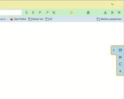
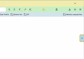
Position rechts/ links lässt sich im Script fest einstellen, die Leiste lässt sich per Button komplett ausschalten, fährt ansonsten bei hover über dem Reiter/Pfeil aus, und dann nach Wunsch verzögert wieder ein.JavaScript
Alles anzeigen//Toggle newtoolbar 8 rechts/links (function() { if (location.href !== 'chrome://browser/content/browser.xhtml') return; let ButtonIcon = 'flower-satt32.png'; let Fly_Position = 0; // 0 = right , 1 = left let ProfilePath = PathUtils.toFileURI(PathUtils.join(PathUtils.profileDir)); let IconPath = '/chrome/icons/'; let ImagePath = ProfilePath + IconPath + ButtonIcon; let flybox_new = document.createXULElement('toolbox'); flybox_new.setAttribute('orient','horizontal'); flybox_new.setAttribute('id','flybox_new'); let tb = document.createXULElement('toolbar'); let tb_label = "New Toolbar"; tb.id = 'new_flybar'; tb.setAttribute('customizable', true); tb.setAttribute("class","toolbar-primary chromeclass-toolbar browser-toolbar customization-target"); tb.setAttribute('orient', 'vertical'); tb.setAttribute('mode', 'icons'); tb.setAttribute("toolboxid","navigator-toolbox"); tb.setAttribute('context', 'toolbar-context-menu'); tb.setAttribute("toolbarname", tb_label); tb.setAttribute("label", tb_label); flybox_new.appendChild(tb); document.getElementById('browser').parentNode.appendChild(flybox_new); CustomizableUI.registerArea('new_flybar', {legacy: true}); CustomizableUI.registerToolbarNode(tb); try { CustomizableUI.createWidget({ id: 'NewToolbar_fly_button', type: 'custom', defaultArea: CustomizableUI.AREA_NAVBAR, onBuild: function(aDocument) { let toolbaritem = aDocument.createXULElement('toolbarbutton'); let props = { id: 'NewToolbar_fly_button', class: 'toolbarbutton-1 chromeclass-toolbar-additional', removable: true, label: 'Toggle New Toolbar', tooltiptext: 'Toggle New toolbar', style: 'list-style-image: url("' + ImagePath + '");', }; for(let p in props) toolbaritem.setAttribute(p, props[p]); return toolbaritem; } }); } catch(e) { }; document.getElementById('NewToolbar_fly_button').addEventListener( "click", flybar ); function flybar() { if (event.button === 0 ) { new_flybar.classList.toggle("fly_off_mode"); } }; if (Fly_Position === 1) { flybox_new.classList.add("fly_left"); } else { flybox_new.classList.remove("fly_left"); }; const css =` :root { --ug-newbar_width: 0px; --ug-newbar_inner_width: 38px; --ug-newbar_max_width: calc(var(--ug-newbar_inner_width) + 2*var(--ug-fly_border)); --ug-arrow_width: 20px; --ug-arrow_height: 64px; --ug-newbar_bg_color: lightblue; --ug-newbar_radius: 8px; --ug-fly_border: 0px; --ug-fly_border_color: orange; --ug-fly_delay: 0.5s; /* animation delay when closing */ } #flybox_new { position: fixed; display: flex; top: 50%; right: 0; transform: translateY(-50%); z-index: 4 !important; height: fit-content; width: fit-content; } #new_flybar { display: flex; min-width: 0px !important; width: var(--ug-newbar_width); overflow: hidden !important; justify-content: center !important; padding-block: 4px; background-color: var(--ug-newbar_bg_color) !important; border-color: var(--ug-fly_border_color); border-style: solid !important; border-width: var(--ug-fly_border); border-radius: 0 0 0 var(--ug-newbar_radius); margin-inline: 0px calc(0px - 2*var(--ug-fly_border)); transition: width 0.5s ease, margin 0.5s ease; transition-delay: var(--ug-fly_delay); } #new_flybar:not([customizing]):hover { width: var(--ug-newbar_max_width); margin-inline: 0px calc(0px - 1*var(--ug-fly_border)); transition-delay: 0s; } #new_flybar:not([customizing]).fly_off_mode { display: none !important; } #new_flybar > :is(.toolbarbutton-1, toolbaritem), #new_flybar toolbarpaletteitem > :is(.toolbarbutton-1, toolbaritem) { margin-inline: 0px !important; margin-block: 2px !important; padding: 0px !important; opacity: 0 !important; transition: opacity 0.25s ease; transition-delay: var(--ug-fly_delay); } #new_flybar:not([customizing]):hover > :is(.toolbarbutton-1, toolbaritem) { opacity: 1 !important; transition: opacity 0.5s ease; transition-delay: 0s; } /*--- arrow ---*/ #new_flybar::before { content:""; display: flex; position: absolute; background-color: lightblue; top: 0px; left: calc(-0px - var(--ug-arrow_width) - 1*var(--ug-fly_border)); height: var(--ug-arrow_height); width: calc(var(--ug-arrow_width) + 1*var(--ug-fly_border)); background-image: url(chrome://global/skin/icons/arrow-left.svg); background-repeat: no-repeat; background-size: 16px; background-position-x: left calc(50% - 0.5*var(--ug-fly_border)) ; background-position-y: calc(50% - 10px); border-right-width: 0px !important; border-radius: var(--ug-newbar_radius) 0 0 var(--ug-newbar_radius); border: var(--ug-fly_border) solid var(--ug-fly_border_color); transition: right 0.5s ease, left 0.5s ease, margin 0.5s ease; transition-delay: var(--ug-fly_delay); } #new_flybar:hover::before { background-image: url(chrome://global/skin/icons/arrow-right.svg); transition-delay: 0s; } /*--- left ---*/ :root:not([customizing]) #flybox_new.fly_left { left: 0; } #flybox_new.fly_left #new_flybar:not([customizing]) { border-radius: 0 0 var(--ug-newbar_radius) 0; margin-inline: calc(0px - 2*var(--ug-fly_border)) 0px; } #flybox_new.fly_left #new_flybar:not([customizing]):hover { width: var(--ug-newbar_max_width); margin-inline: calc(0px - 1*var(--ug-fly_border)) 0px; } #flybox_new.fly_left #new_flybar::before { left: unset; right: calc(-0px - var(--ug-arrow_width) - 1*var(--ug-fly_border)); border-left-width: 0px !important; border-right-width: var(--ug-fly_border) !important; border-radius: 0 var(--ug-newbar_radius) var(--ug-newbar_radius) 0; background-image: url(chrome://global/skin/icons/arrow-right.svg); background-position-x: right calc(50% - 0.5*var(--ug-fly_border)) ; } #flybox_new.fly_left #new_flybar:hover::before { background-image: url(chrome://global/skin/icons/arrow-left.svg); } /*--- customizing ---*/ #new_flybar[customizing] { min-width: var(--ug-newbar_max_width) !important; min-height: var(--ug-newbar_max_width) !important; padding-bottom: 48px !important; border-radius: var(--ug-newbar_radius) 0 0 var(--ug-newbar_radius) !important; } #new_flybar toolbarpaletteitem > :is(.toolbarbutton-1, toolbaritem) { opacity: 1 !important; } #customization-content-container { margin-right: var(--ug-newbar_max_width) !important; } #new_flybar[customizing]::before { display: none !important; } `; const sss = Cc['@mozilla.org/content/style-sheet-service;1'].getService(Ci.nsIStyleSheetService); const uri = Services.io.newURI('data:text/css,' + encodeURIComponent(css)); sss.loadAndRegisterSheet(uri, sss.AGENT_SHEET); })();
Test Icon: flower-satt.png.zip
-
@Horstmann Cool, das ist ja fast so, wie ich mir das vorgestellt habe!
-

@Horstmann Cool, das ist ja fast so, wie ich mir das vorgestellt habe!
Mit fast arbeiten wir hier nicht.

Aus dem Pfeil kann man auch einen zusätzlichen Button machen, der das ein/ausblenden bei click übernimmt; nur ein Button und hover Funktion, das wäre mir zu viel.
-
Update von 00_FlyVertToolbarWithButton_lite.uc.js vom 2025-12-05 gibt es jetzt (und für zukünftige Versionen nur noch) in Beitrag #1 in diesem Thema:
Schaltbare vertikale Overlay-Zusatzleiste ! -
Aus dem Pfeil kann man auch einen zusätzlichen Button machen, der das ein/ausblenden bei click übernimmt; nur ein Button und hover Funktion, das wäre mir zu viel.
Da komme ich vielleicht noch darauf zurück, aber vorerst nicht!
Ich habe mit dem, mit Deinem Skript etwas herumgespielt.
Learning by doing, sozusagen.
Hier mal mein bisheriges Ergebnis, zu dem ich aber noch Fragen hätte!JavaScript
Alles anzeigen//Toggle newtoolbar 8 rechts/links (function() { if (location.href !== 'chrome://browser/content/browser.xhtml') return; let ButtonIcon = 'flower-satt32.png'; let Fly_Position = 0; // 0 = right , 1 = left let ProfilePath = PathUtils.toFileURI(PathUtils.join(PathUtils.profileDir)); let IconPath = '/chrome/icons/'; let ImagePath = ProfilePath + IconPath + ButtonIcon; let Path = PathUtils.toFileURI(PathUtils.join(PathUtils.profileDir, 'chrome', 'icons')); let flybox_new = document.createXULElement('toolbox'); flybox_new.setAttribute('orient','horizontal'); flybox_new.setAttribute('id','flybox_new'); let tb = document.createXULElement('toolbar'); let tb_label = "New Toolbar"; tb.id = 'new_flybar'; tb.setAttribute('customizable', true); tb.setAttribute("class","toolbar-primary chromeclass-toolbar browser-toolbar customization-target"); tb.setAttribute('orient', 'vertical'); tb.setAttribute('mode', 'icons'); tb.setAttribute("toolboxid","navigator-toolbox"); tb.setAttribute('context', 'toolbar-context-menu'); tb.setAttribute("toolbarname", tb_label); tb.setAttribute("label", tb_label); flybox_new.appendChild(tb); document.getElementById('browser').parentNode.appendChild(flybox_new); CustomizableUI.registerArea('new_flybar', {legacy: true}); CustomizableUI.registerToolbarNode(tb); try { CustomizableUI.createWidget({ id: 'NewToolbar_fly_button', type: 'custom', defaultArea: CustomizableUI.AREA_NAVBAR, onBuild: function(aDocument) { let toolbaritem = aDocument.createXULElement('toolbarbutton'); let props = { id: 'NewToolbar_fly_button', class: 'toolbarbutton-1 chromeclass-toolbar-additional', removable: true, label: 'Toggle New Toolbar', tooltiptext: 'Toggle New toolbar', style: 'list-style-image: url("' + ImagePath + '");', }; for(let p in props) toolbaritem.setAttribute(p, props[p]); return toolbaritem; } }); } catch(e) { }; document.getElementById('NewToolbar_fly_button').addEventListener( "click", flybar ); function flybar() { if (event.button === 0 ) { new_flybar.classList.toggle("fly_off_mode"); } }; if (Fly_Position === 1) { flybox_new.classList.add("fly_left"); } else { flybox_new.classList.remove("fly_left"); }; const css =` :root { --ug-newbar_width: 0px; --ug-newbar_inner_width: 32px; --ug-newbar_max_width: calc(var(--ug-newbar_inner_width) + 2*var(--ug-fly_border)); --ug-arrow_width: 20px; --ug-arrow_height: 34px; --ug-newbar_bg_color: #2b2b2b; --ug-newbar_radius: 8px; --ug-fly_border: 3px; --ug-fly_border_color: orange; --ug-fly_delay: 3s; /* animation delay when closing */ } #flybox_new { position: fixed; display: flex; top: 50%; right: 0; transform: translateY(-50%); z-index: 4 !important; height: fit-content; width: fit-content; } #new_flybar { display: flex; min-width: 0px !important; width: var(--ug-newbar_width); overflow: hidden !important; justify-content: center !important; padding-block: 4px; background-color: var(--ug-newbar_bg_color) !important; border-color: var(--ug-fly_border_color); border-style: solid !important; border-width: var(--ug-fly_border); border-radius: 0 0 0 var(--ug-newbar_radius); margin-inline: 0px calc(0px - 2*var(--ug-fly_border)); transition: width 0.5s ease, margin 0.5s ease; transition-delay: var(--ug-fly_delay); } #new_flybar:not([customizing]):hover { width: var(--ug-newbar_max_width); margin-inline: 0px calc(0px - 1*var(--ug-fly_border)); transition-delay: 0s; } #new_flybar:not([customizing]).fly_off_mode { display: none !important; } #new_flybar > :is(.toolbarbutton-1, toolbaritem), #new_flybar toolbarpaletteitem > :is(.toolbarbutton-1, toolbaritem) { margin-block: 2px !important; padding: 0px !important; opacity: 0 !important; transition: opacity 0.25s ease; transition-delay: var(--ug-fly_delay); } #new_flybar:not([customizing]):hover > :is(.toolbarbutton-1, toolbaritem) { opacity: 1 !important; transition: opacity 0.5s ease; transition-delay: 0s; } /*--- arrow ---*/ #new_flybar::before { content:""; display: flex; position: absolute; background-color: var(--ug-newbar_bg_color); top: 0px; left: calc(-0px - var(--ug-arrow_width) - 1*var(--ug-fly_border)); height: var(--ug-arrow_height); width: calc(var(--ug-arrow_width) + 1*var(--ug-fly_border)); /*background-image: url(chrome://global/skin/icons/arrow-left.svg);*/ background-image: url("${Path}/Chevron-left.svg"); -moz-context-properties: fill, fill-opacity; fill: #fafafa; background-repeat: no-repeat; background-size: 16px; background-position-x: left calc(50% - 0.5*var(--ug-fly_border)) ; background-position-y: calc(50% - 0px); border-right-width: 0px !important; border-radius: var(--ug-newbar_radius) 0 0 var(--ug-newbar_radius); border: var(--ug-fly_border) solid var(--ug-fly_border_color); transition: right 0.5s ease, left 0.5s ease, margin 0.5s ease; transition-delay: var(--ug-fly_delay); } #new_flybar:hover::before { /*background-image: url(chrome://global/skin/icons/arrow-right.svg);*/ background-image: url("${Path}/Chevron-right.svg"); -moz-context-properties: fill, fill-opacity; fill: #fafafa; transition-delay: 0s; } /*--- left ---*/ :root:not([customizing]) #flybox_new.fly_left { left: 0; } #flybox_new.fly_left #new_flybar:not([customizing]) { border-radius: 0 0 var(--ug-newbar_radius) 0; margin-inline: calc(0px - 2*var(--ug-fly_border)) 0px; } #flybox_new.fly_left #new_flybar:not([customizing]):hover { width: var(--ug-newbar_max_width); margin-inline: calc(0px - 1*var(--ug-fly_border)) 0px; } #flybox_new.fly_left #new_flybar::before { left: unset; right: calc(-0px - var(--ug-arrow_width) - 1*var(--ug-fly_border)); border-left-width: 0px !important; border-right-width: var(--ug-fly_border) !important; border-radius: 0 var(--ug-newbar_radius) var(--ug-newbar_radius) 0; background-image: url(chrome://global/skin/icons/arrow-right.svg); background-position-x: right calc(50% - 0.5*var(--ug-fly_border)) ; } #flybox_new.fly_left #new_flybar:hover::before { background-image: url(chrome://global/skin/icons/arrow-left.svg); } /*--- customizing ---*/ #new_flybar[customizing] { min-width: var(--ug-newbar_max_width) !important; min-height: var(--ug-newbar_max_width) !important; padding-bottom: 48px !important; border-radius: var(--ug-newbar_radius) 0 0 var(--ug-newbar_radius) !important; } #new_flybar toolbarpaletteitem > :is(.toolbarbutton-1, toolbaritem) { opacity: 1 !important; } #customization-content-container { margin-right: var(--ug-newbar_max_width) !important; } #new_flybar[customizing]::before { display: none !important; } `; const sss = Cc['@mozilla.org/content/style-sheet-service;1'].getService(Ci.nsIStyleSheetService); const uri = Services.io.newURI('data:text/css,' + encodeURIComponent(css)); sss.loadAndRegisterSheet(uri, sss.AGENT_SHEET); })();Es funktioniert so weit alles recht gut, nur warum werden eigene Buttons anders behandelt als jene,
die von Erweiterungen stammen.Zum Beispiel werden die Buttons von Erweiterungen weiter rechts dargestellt.
Sie sind also etwas außerhalb der Mitte.
Dann "eigene" Buttons, deren Hintergrundfarbe, beim Hovern, entspricht nicht der im Skript definierten Farbe.
Bei einem roten Symbol im Button ist die "Hoverfarbe" dann auch leicht rötlich.
Bei blau bläulich und bei gelb eben gelblich.
Nur bei Buttons von Erweiterungen, da stimmt es! -
Alles anzeigen
Es funktioniert so weit alles recht gut, nur warum werden eigene Buttons anders behandelt als jene,
die von Erweiterungen stammen.Zum Beispiel werden die Buttons von Erweiterungen weiter rechts dargestellt.
Sie sind also etwas außerhalb der Mitte.
Dann "eigene" Buttons, deren Hintergrundfarbe, beim Hovern, entspricht nicht der im Skript definierten Farbe.
Bei einem roten Symbol im Button ist die "Hoverfarbe" dann auch leicht rötlich.
Bei blau bläulich und bei gelb eben gelblich.
Nur bei Buttons von Erweiterungen, da stimmt es!Ich wage mal den Verdacht zu äussern, dass du Code benutzt der Buttons manipuliert.

So ungefähr 8000 Zeile an Code für Buttons, oder so.Wenn du alles davon mal weglässt, gibt es dann die Probleme immer noch?

Oder, gibt es die Probleme auch, wenn du stattdessen mein Script von hier probierst?
Und was die Farben angeht: niemals benutzt man color um Icons zu färben, nur fill oder stroke, weil man sonst oft die gesamte Buttonfarbe manipuliert - Text und hover-Hintergrund.
Text kann man zur Not gezielt anpassen, color wird in Fx für alles Mögliche benutzt, und nicht für eigene Buttons etc. separiert.
Gefühlt 1000x habe ich darauf hingewiesen - also ca. 5-6x plus Windfaktor - aber das hält sich hartnäckig.Edit: bei dir ca. in Zeile 134, füge mal margin-inline: 0px !important; in dem Code Block dazu, für den Abstand von Erweiterungen Items.
-
Danke @Horstmann
Mit margin-inline: 0px !important; das Problem mit der Ausrichtung gelöst!
Und da das Problem mit der Hintergrundfarbe in Deinem vorgeschlagenen Skript,
wie auch in Mitlesers Skript vorhanden war/ist, konnte die Ursache ja nur im Skript
für die eigenen Buttons liegen.
Habe den Fehler lokalisieren können und werde dahingehen alle "Buttons" überarbeiten. -
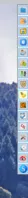
Und noch eine Variante, mit zusätzlichem Button direkt an der Leiste zum ein/ausfahren, statt hover.
Etwas grob, aber sollte im Prinzip klappen.
Nur Basisoptionen, kein Geschnösel.JavaScript
Alles anzeigen// Toggle newtoolbar 10 rechts/links, extra button instead of hover, button inside // 00_flybar_V10bi.uc.js (function() { if (location.href !== 'chrome://browser/content/browser.xhtml') return; // Custom Icon, expected in profile-name/chrome/icons folder ("icons" folder needs to be created) let ButtonIcon = 'flower-satt32.png'; // start positions let Fly_Position = 0; // 0 = right , 1 = left let Fly_InOrOut = 0; // 0 = bar extended , 1 = bar collapsed let ProfilePath = PathUtils.toFileURI(PathUtils.join(PathUtils.profileDir)); let IconPath = '/chrome/icons/'; let ImagePath = ProfilePath + IconPath + ButtonIcon; let flybox_new = document.createXULElement('toolbox'); flybox_new.setAttribute('orient','horizontal'); flybox_new.setAttribute('id','flybox_new'); let tb = document.createXULElement('toolbar'); let tb_label = "New Toolbar"; tb.id = 'new_flybar'; tb.setAttribute('customizable', true); tb.setAttribute("class","toolbar-primary chromeclass-toolbar browser-toolbar customization-target"); tb.setAttribute('orient', 'vertical'); tb.setAttribute('mode', 'icons'); tb.setAttribute('context', 'toolbar-context-menu'); tb.setAttribute("toolbarname", tb_label); tb.setAttribute("label", tb_label); flybox_new.appendChild(tb); document.getElementById('browser').parentNode.appendChild(flybox_new); CustomizableUI.registerArea('new_flybar', {legacy: true}); CustomizableUI.registerToolbarNode(tb); try { CustomizableUI.createWidget({ id: 'NewToolbar_fly_button', type: 'custom', defaultArea: CustomizableUI.AREA_NAVBAR, onBuild: function(aDocument) { let toolbaritem = aDocument.createXULElement('toolbarbutton'); let props = { id: 'NewToolbar_fly_button', class: 'toolbarbutton-1 chromeclass-toolbar-additional', removable: true, label: 'Toggle New Toolbar', tooltiptext: 'Toggle New toolbar', style: 'list-style-image: url("' + ImagePath + '");', }; for(let p in props) toolbaritem.setAttribute(p, props[p]); return toolbaritem; } }); } catch(e) { }; document.getElementById('NewToolbar_fly_button').addEventListener( "click", flybar ); function flybar() { if (event.button === 0 ) { new_flybar.classList.toggle("fly_off_mode"); } }; if (Fly_Position === 1) { flybox_new.classList.add("fly_left"); } else { flybox_new.classList.remove("fly_left"); }; try { CustomizableUI.createWidget({ id: 'ntb_flyInOut_btn', defaultArea: CustomizableUI.AREA_NAVBAR, tooltiptext: 'Fly Me', label: 'Fly Me', removable: false, }); } catch(e) { } if (Fly_InOrOut === 1) { flybox_new.classList.remove("fly_InOut_mode"); } else { flybox_new.classList.add("fly_InOut_mode"); }; // 1st child let addy = document.getElementById('new_flybar'); let addybe = document.getElementById('ntb_flyInOut_btn'); addy.insertBefore(addybe, addy.firstChild); document.getElementById('ntb_flyInOut_btn').addEventListener( "click", flyInOut); function flyInOut() { if (event.button === 0 ) { flybox_new.classList.toggle("fly_InOut_mode"); } }; const css =` /* Botton inside */ :root { --ug-newbar_width: 0px; --ug-newbar_inner_width: 38px; /* minimum 32px */ --ug-newbar_max_width: calc(var(--ug-newbar_inner_width) + 2*var(--ug-fly_border)); --ug-arrow_left: url(chrome://global/skin/icons/arrow-left.svg); --ug-arrow_right: url(chrome://global/skin/icons/arrow-right.svg); --ug-newbar_bg_color: lightblue; --ug-newbar_radius: 8px; --ug-fly_border: 3px; --ug-fly_border_color: orange; } #flybox_new { position: fixed; display: flex; top: 50%; right: 0px; transform: translateY(-50%); z-index: 4 !important; height: fit-content; width: fit-content; } #ntb_flyInOut_btn, #new_flybar { display: flex; min-width: 0px !important; width: var(--ug-newbar_width); justify-content: center !important; background-color: var(--ug-newbar_bg_color) !important; border-color: var(--ug-fly_border_color); border-style: solid !important; border-width: var(--ug-fly_border); transition: width 0.5s ease, margin 0.5s ease, padding 0.5s ease, border-radius 0.5s ease; } #new_flybar { min-height: var(--ug-newbar_max_width) !important; border-radius: 0 0 0 var(--ug-newbar_radius); overflow: hidden !important; border-top-color: transparent; padding-block: 4px 4px; margin-inline: 0px calc(0px - 2*var(--ug-fly_border)); } #flybox_new.fly_InOut_mode #new_flybar:not([customizing]) { width: var(--ug-newbar_max_width); margin-inline: 0px calc(0px - var(--ug-fly_border)); } #new_flybar > :is(.toolbarbutton-1, toolbaritem), #new_flybar toolbarpaletteitem > :is(.toolbarbutton-1, toolbaritem) { margin-inline: 0px !important; margin-block: 2px !important; padding-inline: 0px !important; z-index: 6 !important; } #new_flybar:not([customizing]) toolbarbutton:not(#ntb_flyInOut_btn) { transition: opacity 0.25s ease; opacity: 0 !important; } #flybox_new.fly_InOut_mode #new_flybar toolbarbutton { opacity: 1 !important; } /*--- arrow button ---*/ #ntb_flyInOut_btn { position: absolute; list-style-image: var(--ug-arrow_right); top: calc(0px - 32px - 6px - 0*var(--ug-fly_border)); right: calc(0px - var(--ug-fly_border)); width: var(--ug-newbar_max_width); border-radius: var(--ug-newbar_radius) 0 0 var(--ug-newbar_radius); } #flybox_new.fly_InOut_mode #ntb_flyInOut_btn { border-radius: var(--ug-newbar_radius) 0 0 0; } #flybox_new:not(.fly_InOut_mode) #ntb_flyInOut_btn::after { width: 0px; } #flybox_new:not(.fly_InOut_mode) #ntb_flyInOut_btn { list-style-image: var(--ug-arrow_left) !important; width: calc(var(--ug-newbar_max_width) - 12px); } #ntb_flyInOut_btn image { margin-block: 6px !important; transition: width 0.5s ease !important; } #flybox_new:not(.fly_InOut_mode) #ntb_flyInOut_btn image { --toolbarbutton-inner-padding: 8px 2px !important; } /* gap */ #flybox_new #ntb_flyInOut_btn::after { content:""; /* display: none; */ position: absolute; background: linear-gradient(to right, var(--ug-fly_border_color) var(--ug-fly_border), var(--ug-newbar_bg_color) var(--ug-fly_border)); bottom: calc(0px - 1*var(--ug-fly_border)); right: calc(0px - 0*var(--ug-fly_border)); width: calc(100% + var(--ug-fly_border)); height: var(--ug-fly_border); transition: width 0.5s ease; } /*--- left ---*/ :root:not([customizing]) #flybox_new.fly_left { right: unset; left: 0px; } #flybox_new.fly_left #new_flybar:not([customizing]) { margin-inline: calc(0px - 2*var(--ug-fly_border)) 0px; } #flybox_new.fly_left #new_flybar { border-radius: 0 0 var(--ug-newbar_radius) 0; } #flybox_new.fly_left.fly_InOut_mode #new_flybar:not([customizing]) { margin-inline: calc(0px - var(--ug-fly_border)) 0px; } /*--- arrow button left ---*/ #flybox_new.fly_left #ntb_flyInOut_btn { list-style-image: var(--ug-arrow_right) !important; left: calc(0px - var(--ug-fly_border)); border-radius: 0 var(--ug-newbar_radius) var(--ug-newbar_radius) 0; } #flybox_new.fly_left.fly_InOut_mode #ntb_flyInOut_btn { } #flybox_new.fly_left.fly_InOut_mode #ntb_flyInOut_btn { list-style-image: var(--ug-arrow_left) !important; border-radius: 0 var(--ug-newbar_radius) 0 0; } /* gap left */ #flybox_new.fly_left #ntb_flyInOut_btn::after { background: linear-gradient(to left, var(--ug-fly_border_color) var(--ug-fly_border), var(--ug-newbar_bg_color) var(--ug-fly_border)); left: calc(0px - 0*var(--ug-fly_border)); } /*-- Off --*/ #new_flybar:not([customizing]).fly_off_mode { display: none !important; } /*--- customizing ---*/ #new_flybar[customizing] { align-items: center !important; width: calc(var(--ug-newbar_max_width) + var(--ug-fly_border)) !important; min-height: var(--ug-newbar_max_width) !important; padding-bottom: 48px !important; padding-right: var(--ug-fly_border) !important; border-radius: var(--ug-newbar_radius) 0 0 var(--ug-newbar_radius) !important; border-color: var(--ug-fly_border_color); } #new_flybar toolbarpaletteitem > :is(.toolbarbutton-1, toolbaritem), #new_flybar toolbarpaletteitem[removable="false"]{ opacity: 1 !important; } #customization-content-container { margin-right: var(--ug-newbar_max_width) !important; } #new_flybar[customizing] #ntb_flyInOut_btn { display: none !important; } /*- test colors -*/ /* #flybox_new image { outline-offset: -1px !important; outline: 1px solid green !important; } */ `; const sss = Cc['@mozilla.org/content/style-sheet-service;1'].getService(Ci.nsIStyleSheetService); const uri = Services.io.newURI('data:text/css,' + encodeURIComponent(css)); sss.loadAndRegisterSheet(uri, sss.AGENT_SHEET); })();Testicon: icons.zip
-
Die Version aus #22 funktionierte wunderbar!
Von der Optik gefiel sie mir auch.
Nun sehe ich Deine neue Variante, und dachte, cool, übertrage doch einfach den Code für das "Klicken" auf den Pfeil.
Falsch gedacht!!
Das CSS ist ja sowas von anders! Da steige ich nicht durch.
Und leider gefällt mir die Optik nicht!
Verrätst Du mir, wie man den Pfeil, bzw. diese Fläche wieder vor die Leiste bekommt.
Also das die Optik wieder genau der Optik aus #22 entspricht. -
Verrätst Du mir, wie man den Pfeil, bzw. diese Fläche wieder vor die Leiste bekommt.
Also das die Optik wieder genau der Optik aus #22 entspricht.Du müsstest dir das selber anschauen, das CSS ist aufwendig, und ich biete momentan nur die existierenden Versionen an.
Mir gefällt es besser, wenn der Button nach dem Ausklappen nicht noch zusätzlich Platz in Richtung Browserinhalt einnimmt.Im Prinzip musst du nur das ::before Element von #22 mit dem Button von #29 ersetzen, und dann halt basteln.
Hier wäre ein Anfang für ein alternatives CSS in deinem Sinne; eine komplette Anpassung ist mir zu viel Aufwand. -
Du müsstest dir das selber anschauen, das CSS ist aufwendig, und ich biete momentan nur die existierenden Versionen an.
Mir gefällt es besser, wenn der Button nach dem Ausklappen nicht noch zusätzlich Platz in Richtung Browserinhalt einnimmt.Schade, aber so sind die "Geschmäcker" halt verschieden.
Is´ so!Im Prinzip musst du nur das ::before Element von #22 mit dem Button von #29 ersetzen, und dann halt basteln.
Hier wäre ein Anfang für ein alternatives CSS in deinem Sinne; eine komplette Anpassung ist mir zu viel Aufwand.Und da ich mit CSS irgendwie auf Kriegsfuß stehe, wenn es um so aufwändigen und komplexen Code geht,
bleibe ich erst einmal bei meiner Interpretation Deiner Leiste.Aber vielen lieben Dank für die zusätzliche Leiste.
-
Schade, aber so sind die "Geschmäcker" halt verschieden.
Schwach geworden, wie immer ...
Hier dann die Leiste mit Button und das Ding sitzt aussen.
Wobei sich bei den Versionen mit Extra Button schon die Frage stellt, warum man nicht einfach den Hauptbutton benutzt, den zum komplett Ausschalten der Leiste.JavaScript
Alles anzeigen// Toggle newtoolbar 10 rechts/links, extra button instead of hover, button outside // 00_flybar_V10bo.uc.js (function() { if (location.href !== 'chrome://browser/content/browser.xhtml') return; // Custom Icon, expected in profile-name/chrome/icons folder ("icons" folder needs to be created) let ButtonIcon = 'flower-satt32.png'; // start positions let Fly_Position = 0; // 0 = right , 1 = left let Fly_InOrOut = 0; // 0 = bar extended , 1 = bar collapsed let ProfilePath = PathUtils.toFileURI(PathUtils.join(PathUtils.profileDir)); let IconPath = '/chrome/icons/'; let ImagePath = ProfilePath + IconPath + ButtonIcon; let flybox_new = document.createXULElement('toolbox'); flybox_new.setAttribute('orient','horizontal'); flybox_new.setAttribute('id','flybox_new'); let tb = document.createXULElement('toolbar'); let tb_label = "New Toolbar"; tb.id = 'new_flybar'; tb.setAttribute('customizable', true); tb.setAttribute("class","toolbar-primary chromeclass-toolbar browser-toolbar customization-target"); tb.setAttribute('orient', 'vertical'); tb.setAttribute('mode', 'icons'); tb.setAttribute('context', 'toolbar-context-menu'); tb.setAttribute("toolbarname", tb_label); tb.setAttribute("label", tb_label); flybox_new.appendChild(tb); document.getElementById('browser').parentNode.appendChild(flybox_new); CustomizableUI.registerArea('new_flybar', {legacy: true}); CustomizableUI.registerToolbarNode(tb); try { CustomizableUI.createWidget({ id: 'NewToolbar_fly_button', type: 'custom', defaultArea: CustomizableUI.AREA_NAVBAR, onBuild: function(aDocument) { let toolbaritem = aDocument.createXULElement('toolbarbutton'); let props = { id: 'NewToolbar_fly_button', class: 'toolbarbutton-1 chromeclass-toolbar-additional', removable: true, label: 'Toggle New Toolbar', tooltiptext: 'Toggle New toolbar', style: 'list-style-image: url("' + ImagePath + '");', }; for(let p in props) toolbaritem.setAttribute(p, props[p]); return toolbaritem; } }); } catch(e) { }; document.getElementById('NewToolbar_fly_button').addEventListener( "click", flybar ); function flybar() { if (event.button === 0 ) { new_flybar.classList.toggle("fly_off_mode"); } }; if (Fly_Position === 1) { flybox_new.classList.add("fly_left"); } else { flybox_new.classList.remove("fly_left"); }; try { CustomizableUI.createWidget({ id: 'ntb_flyInOut_btn', defaultArea: CustomizableUI.AREA_NAVBAR, tooltiptext: 'Fly Me', label: 'Fly Me', removable: false, }); } catch(e) { } if (Fly_InOrOut === 1) { flybox_new.classList.remove("fly_InOut_mode"); } else { flybox_new.classList.add("fly_InOut_mode"); }; // 1st child let addy = document.getElementById('new_flybar'); let addybe = document.getElementById('ntb_flyInOut_btn'); addy.insertBefore(addybe, addy.firstChild); document.getElementById('ntb_flyInOut_btn').addEventListener( "click", flyInOut); function flyInOut() { if (event.button === 0 ) { flybox_new.classList.toggle("fly_InOut_mode"); } }; const css =` /* Button outside */ :root { --ug-newbar_width: 0px; --ug-newbar_inner_width: 36px; /* minimum 32px */ --ug-newbar_max_width: calc(var(--ug-newbar_inner_width) + 2*var(--ug-fly_border)); --ug-arrow_width: 26px; --ug-arrow_left: url(chrome://global/skin/icons/arrow-left.svg); --ug-arrow_right: url(chrome://global/skin/icons/arrow-right.svg); --ug-newbar_bg_color: lightblue; --ug-newbar_radius: 8px; --ug-fly_border: 3px; --ug-fly_border_color: orange; } #flybox_new { position: fixed; display: flex; top: 50%; right: 0px; transform: translateY(-50%); z-index: 4 !important; height: fit-content; width: fit-content; } #ntb_flyInOut_btn, #new_flybar { display: flex; min-width: 0px !important; width: var(--ug-newbar_width); justify-content: center !important; background-color: var(--ug-newbar_bg_color) !important; border-color: var(--ug-fly_border_color); border-style: solid !important; border-width: var(--ug-fly_border); transition: width 0.5s ease, margin 0.5s ease, padding 0.5s ease /*, left 0.5s ease, right 0.5s ease*/; } #new_flybar { margin-inline: 0px calc(0px - 2*var(--ug-fly_border)); min-height: var(--ug-newbar_max_width) !important; border-radius: 0 0 0 var(--ug-newbar_radius); overflow: hidden !important; padding-block: 4px; } #flybox_new.fly_InOut_mode #new_flybar:not([customizing]) { width: var(--ug-newbar_max_width); margin-inline: 0px calc(0px - var(--ug-fly_border)); } #new_flybar > :is(.toolbarbutton-1, toolbaritem), #new_flybar toolbarpaletteitem > :is(.toolbarbutton-1, toolbaritem) { margin-inline: 0px !important; margin-block: 2px !important; padding-inline: 0px !important; z-index: 6 !important; } #new_flybar:not([customizing]) toolbarbutton:not(#ntb_flyInOut_btn) { transition: opacity 0.25s ease; opacity: 0 !important; } #flybox_new.fly_InOut_mode #new_flybar toolbarbutton { opacity: 1 !important; } /*--- arrow button ---*/ #flybox_new #ntb_flyInOut_btn { position: absolute; list-style-image: var(--ug-arrow_right); left: calc(-1*var(--ug-arrow_width) - 1*var(--ug-fly_border)); top: calc(0px - var(--ug-fly_border)); box-sizing: content-box; width: var(--ug-arrow_width); border-radius: var(--ug-newbar_radius) 0 0 var(--ug-newbar_radius); border-inline-width: var(--ug-fly_border) 0px; margin-block: var(--ug-fly_border) !important; } #flybox_new #ntb_flyInOut_btn::after { content:""; position: absolute; background-color: inherit; right: calc(0px - 1*var(--ug-fly_border)); height: 100%; width: var(--ug-fly_border); } #flybox_new:not(.fly_InOut_mode) #ntb_flyInOut_btn { list-style-image: var(--ug-arrow_left) !important; } #ntb_flyInOut_btn image { /* margin-inline: calc(var(--ug-fly_border)) !important; */ margin-block: 6px !important; --toolbarbutton-inner-padding: 8px 2px !important; } /*--- left ---*/ :root:not([customizing]) #flybox_new.fly_left { right: unset; left: 0px; } #flybox_new.fly_left #new_flybar:not([customizing]) { margin-inline: calc(0px - 2*var(--ug-fly_border)) 0px; } #flybox_new.fly_left #new_flybar { border-radius: 0 0 var(--ug-newbar_radius) 0; } #flybox_new.fly_left.fly_InOut_mode #new_flybar:not([customizing]) { margin-inline: calc(0px - var(--ug-fly_border)) 0px; } /*--- arrow button left ---*/ #flybox_new.fly_left #ntb_flyInOut_btn { list-style-image: var(--ug-arrow_right) !important; left: unset; right: calc(-1*var(--ug-arrow_width) - 1*var(--ug-fly_border)); border-radius: 0 var(--ug-newbar_radius) var(--ug-newbar_radius) 0; border-inline-width: 0px var(--ug-fly_border); } #flybox_new.fly_left.fly_InOut_mode #ntb_flyInOut_btn { list-style-image: var(--ug-arrow_left) !important; } #flybox_new.fly_left #ntb_flyInOut_btn::after { left: calc(0px - 1*var(--ug-fly_border)); } /*-- Off --*/ #new_flybar:not([customizing]).fly_off_mode { display: none !important; } /*--- customizing ---*/ #new_flybar[customizing] { align-items: center !important; min-width: var(--ug-newbar_max_width) !important; width: calc(var(--ug-newbar_max_width) + var(--ug-fly_border)) !important; min-height: var(--ug-newbar_max_width) !important; padding-bottom: 48px !important; padding-right: var(--ug-fly_border) !important; border-radius: var(--ug-newbar_radius) 0 0 var(--ug-newbar_radius) !important; border-color: var(--ug-fly_border_color); } #new_flybar toolbarpaletteitem > :is(.toolbarbutton-1, toolbaritem), #new_flybar toolbarpaletteitem[removable="false"]{ opacity: 1 !important; } #customization-content-container { margin-right: var(--ug-newbar_max_width) !important; } #new_flybar[customizing] #ntb_flyInOut_btn { display: none !important; } /*- test colors -*/ /* #flybox_new image { outline-offset: -1px !important; outline: 1px solid green !important; } */ `; const sss = Cc['@mozilla.org/content/style-sheet-service;1'].getService(Ci.nsIStyleSheetService); const uri = Services.io.newURI('data:text/css,' + encodeURIComponent(css)); sss.loadAndRegisterSheet(uri, sss.AGENT_SHEET); })();Icon: flower-satt.png.zip
-
Wobei sich bei den Versionen mit Extra Button schon die Frage stellt, warum man nicht einfach den Hauptbutton benutzt, ...
Das frage ich mich auch.

Ich bin noch am Testen und hatte diese Idee.
Ob es nun sinnvoll ist, steht auf einem anderen Blatt.
Und wie und ob ich so eine Leite nutzen werde, steht auch noch nicht zu 100% fest,
aber so habe ich nun ein halbes dutzend Optionen.
Danke.
-
Lange hat es gedauert, viel Versuche waren nötig, aber jetzt habe ich es!
Die zusätzliche Toolbar ist endlich so, wie sie für mich sein soll.
Ich danke Dir @Horstmann und auch Mitleser für Eure Ideen und eigenen Umsetzungen einer solchen Leiste.Hier nun meine Interpretation der Codeschnipsel, die ich aus Euren Skripten bunt zusammen gewürfelt habe.
Wer es mal testen mag, bitte schön.JavaScript
Alles anzeigen// New switchable toolbar rechts/links – Version mit gleitendem Slide‑In/Out‑Effekt (function() { if (!window.gBrowser) return; const // ■■ START UserConfiguration ■■■■■■■■■■■■■■■■■■■■■■■■■■■■■■■■ id = 'NewToolbar_fly_button', label = 'Toggle New Toolbar', tooltiptext = 'Toggle New toolbar', // Icon------------------------------------------------------- icon = 'Dock Side Right.svg', // Icon-Dateiname iconPath = '/chrome/icons/', visible = '34px', // Sichtbare Leistenbreite isPosH = 0, // 0 = rechts, 1 = links isPosV = '30%', // vertikale Position der Leiste // isPosV = '0%', Leiste am oberen Fensterrand; // isPosV = '50%', Leiste mittig zur Fensterhöhe; // isPosV = '100%', Leiste am unteren Fensterrand; delay = '0.6s'; // Dauer (schneller/langsamer) // ■■ END UserConfiguration ■■■■■■■■■■■■■■■■■■■■■■■■■■■■■■■■■■ const curProfDir = PathUtils.toFileURI(PathUtils.join(PathUtils.profileDir)); if (Services.prefs.getBoolPref('svg.context-properties.content.enabled') == false) { Services.prefs.setBoolPref('svg.context-properties.content.enabled', true); } const flybox_new = document.createXULElement('toolbox'); flybox_new.setAttribute('orient','horizontal'); flybox_new.id = 'flybox_new'; const toolbar = document.createXULElement('toolbar'); toolbar.id = 'new_flybar'; toolbar.setAttribute('orient', 'vertical'); toolbar.setAttribute('customizable', true); toolbar.setAttribute('mode', 'icons'); toolbar.setAttribute('context', 'toolbar-context-menu'); toolbar.setAttribute('class','toolbar-primary chromeclass-toolbar browser-toolbar customization-target'); toolbar.setAttribute('toolboxid', 'navigator-toolbox'); toolbar.setAttribute('toolbarname', 'New Toolbar'); toolbar.setAttribute('label', 'New Toolbar'); let savedState = false; try { savedState = Services.prefs.getBoolPref("userChrome.newFlybar.off"); } catch(e) {} if (savedState) toolbar.classList.add("fly_off_mode"); flybox_new.appendChild(toolbar); document.getElementById('browser').parentNode.appendChild(flybox_new); CustomizableUI.registerArea(toolbar.id, {legacy: true}); CustomizableUI.registerToolbarNode(toolbar); try { CustomizableUI.createWidget({ id, defaultArea: CustomizableUI.AREA_NAVBAR, label, tooltiptext, onCreated: (button) => { button.style.MozContextProperties = 'fill, stroke, fill-opacity'; button.style.listStyleImage = 'url("' + curProfDir + iconPath + icon + '")'; button.style.minWidth = 'fit-content'; } }); } catch(e) {}; document.getElementById('NewToolbar_fly_button').addEventListener("click", flybar); function flybar(event) { if (event.button === 0) { const new_flybar = document.getElementById('new_flybar'); new_flybar.classList.toggle("fly_off_mode"); const state = new_flybar.classList.contains("fly_off_mode"); Services.prefs.setBoolPref("userChrome.newFlybar.off", state); } } if (isPosH === 1) flybox_new.classList.add("fly_left"); else flybox_new.classList.remove("fly_left"); const css = ` :root { --ug-toolbar_width: ${visible}; --ug-bg_color: #2b2b2b; --ug-border_width: 2px; --ug-border_radius: 8px; --ug-border_color: #f3a200; } #flybox_new { position: fixed !important; display: flex !important; ${isPosH === 0 ? `right: 0 !important; margin-right: calc(-1 * var(--ug-border_width));` : `left: 0 !important; margin-left: calc(-1 * var(--ug-border_width));`} top: ${isPosV} !important; transform: translateY(-${isPosV}) !important; height: fit-content !important; z-index: 4 !important; } #new_flybar { display: flex; width: var(--ug-toolbar_width); min-width: 0 !important; overflow: hidden !important; justify-content: center !important; padding-block: 4px; background-color: var(--ug-bg_color) !important; border: var(--ug-border_width) solid var(--ug-border_color) !important; ${isPosH === 0 ? `border-radius: var(--ug-border_radius) 0 0 var(--ug-border_radius);` : `border-radius: 0 var(--ug-border_radius) var(--ug-border_radius) 0;`} transition: transform ${delay} ease-in-out, opacity ${delay} ease-in-out, border-width ${delay} ease-in-out; transform: translateX(0); opacity: 1; } #new_flybar.fly_off_mode { transform: ${isPosH === 0 ? 'translateX(100%)' : 'translateX(-100%)'}; opacity: 0; border-width: 0 !important; pointer-events: none; } #new_flybar > :is(.toolbarbutton-1, toolbaritem), #new_flybar toolbarpaletteitem > :is(.toolbarbutton-1, toolbaritem) { margin-inline: 0px !important; margin-block: 2px !important; padding: 0px !important; opacity: 1 !important; transition: none; } `; const sss = Cc['@mozilla.org/content/style-sheet-service;1'].getService(Ci.nsIStyleSheetService); const uri = Services.io.newURI('data:text/css,' + encodeURIComponent(css)); sss.loadAndRegisterSheet(uri, sss.AGENT_SHEET); })();Skript ist unter Zuhilfenahme von KI entstanden.
PS:
Das mit dem Pfeil war wirklich eine blöde Idee,
aber hinterher ist man immer schlauer, heißt es doch, oder? -
Lange hat es gedauert, viel Versuche waren nötig, aber jetzt habe ich es!
Ja, hast du! Funktioniert!

-
Lange hat es gedauert, viel Versuche waren nötig, aber jetzt habe ich es!
Die zusätzliche Toolbar ist endlich so, wie sie für mich sein soll.
Ich danke Dir @Horstmann und auch Mitleser für Eure Ideen und eigenen Umsetzungen einer solchen Leiste.Hier nun meine Interpretation der Codeschnipsel, die ich aus Euren Skripten bunt zusammen gewürfelt habe.
Wer es mal testen mag, bitte schön.Prima zusammengewürfelt, da hab ich was draus gelernt!
Nur eines, die Breite passt sich nicht an die Borderbreite an (mal 8px testen), Zeile 111 könntest du zu sowas ändern :
width: calc(var(--ug-toolbar_width) + 2*var(--ug-border_width));
Und auch wenn ihr kein anständiges Anpassenfenster mögt , hier mal ein Vorschlag:JavaScript
Alles anzeigen// New switchable toolbar rechts/links – Version mit gleitendem Slide‑In/Out‑Effekt // TEST mit Anpassenfenster (function() { if (!window.gBrowser) return; const // ■■ START UserConfiguration ■■■■■■■■■■■■■■■■■■■■■■■■■■■■■■■■ id = 'NewToolbar_fly_button', label = 'Toggle New Toolbar', tooltiptext = 'Toggle New toolbar', // Icon------------------------------------------------------- icon = 'Dock Side Right.svg', // Icon-Dateiname iconPath = '/chrome/icons/', visible = '38px', // Sichtbare Leistenbreite isPosH = 0, // 0 = rechts, 1 = links isPosV = '30%', // vertikale Position der Leiste // isPosV = '0%', Leiste am oberen Fensterrand; // isPosV = '50%', Leiste mittig zur Fensterhöhe; // isPosV = '100%', Leiste am unteren Fensterrand; delay = '0.6s'; // Dauer (schneller/langsamer) // ■■ END UserConfiguration ■■■■■■■■■■■■■■■■■■■■■■■■■■■■■■■■■■ const curProfDir = PathUtils.toFileURI(PathUtils.join(PathUtils.profileDir)); if (Services.prefs.getBoolPref('svg.context-properties.content.enabled') == false) { Services.prefs.setBoolPref('svg.context-properties.content.enabled', true); } const flybox_new = document.createXULElement('toolbox'); flybox_new.setAttribute('orient','horizontal'); flybox_new.id = 'flybox_new'; const fly_bar = document.createXULElement('toolbar'); fly_bar.id = 'new_flybar'; fly_bar.setAttribute('orient', 'vertical'); fly_bar.setAttribute('customizable', true); fly_bar.setAttribute('mode', 'icons'); fly_bar.setAttribute('context', 'toolbar-context-menu'); fly_bar.setAttribute('class','toolbar-primary chromeclass-toolbar browser-toolbar customization-target'); fly_bar.setAttribute('toolboxid', 'navigator-toolbox'); fly_bar.setAttribute('toolbarname', 'New Toolbar'); fly_bar.setAttribute('label', 'New Toolbar'); let savedState = false; try { savedState = Services.prefs.getBoolPref("userChrome.newFlybar.off"); } catch(e) {} if (savedState) fly_bar.classList.add("fly_off_mode"); flybox_new.appendChild(fly_bar); document.getElementById('browser').parentNode.appendChild(flybox_new); CustomizableUI.registerArea(fly_bar.id, {legacy: true}); CustomizableUI.registerToolbarNode(fly_bar); try { CustomizableUI.createWidget({ id, defaultArea: CustomizableUI.AREA_NAVBAR, label, tooltiptext, onCreated: (button) => { button.style.MozContextProperties = 'fill, stroke, fill-opacity, stroke-opacity'; button.style.listStyleImage = 'url("' + curProfDir + iconPath + icon + '")'; button.style.minWidth = 'fit-content'; } }); } catch(e) {}; document.getElementById('NewToolbar_fly_button').addEventListener("click", flybar); function flybar(event) { if (event.button === 0) { const new_flybar = document.getElementById('new_flybar'); new_flybar.classList.toggle("fly_off_mode"); const state = new_flybar.classList.contains("fly_off_mode"); Services.prefs.setBoolPref("userChrome.newFlybar.off", state); } } if (isPosH === 1) flybox_new.classList.add("fly_left"); else flybox_new.classList.remove("fly_left"); const css = ` :root { --ug-toolbar_width: ${visible}; --ug-bg_color: #2b2b2b; --ug-fly_border_width: 2px; --ug-border_radius: 8px; --ug-border_color: #f3a200; } #flybox_new { position: fixed !important; display: flex !important; ${isPosH === 0 ? `right: 0 ; margin-right: calc(-1 * var(--ug-fly_border_width));` : `left: 0 ; margin-left: calc(-1 * var(--ug-fly_border_width));`} top: ${isPosV} !important; transform: translateY(-${isPosV}) !important; height: fit-content !important; z-index: 4 !important; } #new_flybar { display: flex; width: calc(var(--ug-toolbar_width) + 2*var(--ug-fly_border_width)); min-width: 0 !important; overflow: hidden !important; justify-content: center !important; padding-block: 4px; background-color: var(--ug-bg_color) !important; border: var(--ug-fly_border_width) solid var(--ug-border_color) !important; ${isPosH === 0 ? `border-radius: var(--ug-border_radius) 0 0 var(--ug-border_radius);` : `border-radius: 0 var(--ug-border_radius) var(--ug-border_radius) 0;`} transition: transform ${delay} ease-in-out, opacity ${delay} ease-in-out, border-width ${delay} ease-in-out; transform: translateX(0); opacity: 1; } #new_flybar.fly_off_mode:not([customizing]) { transform: ${isPosH === 0 ? 'translateX(100%)' : 'translateX(-100%)'}; opacity: 0; border-width: 0px !important; /*pointer-events: none;*/ } #new_flybar > :is(.toolbarbutton-1, toolbaritem), #new_flybar toolbarpaletteitem > :is(.toolbarbutton-1, toolbaritem) { margin-inline: 0px !important; margin-block: 2px !important; padding: 0px !important; /*opacity: 1 !important;*/ transition: none; } /*--- customizing ---*/ #main-window[customizing] #flybox_new.fly_left { left: unset !important; right: 0px !important; margin-inline: 0px calc(-1 * var(--ug-fly_border_width)) !important; } #new_flybar[customizing] { align-items: center !important; width: calc(var(--ug-toolbar_width) + var(--ug-fly_border_width)) !important; min-height: var(--ug-toolbar_width) !important; padding-bottom: 48px !important; border-radius: var(--ug-border_radius) 0 0 var(--ug-border_radius) !important; transition: none !important; } #main-window:not([customizing]) #new_flybar.fly_off_mode[customizing] { transition: none !important; opacity: 0 !important; } #customization-content-container { margin-right: var(--ug-toolbar_width) !important; } `; const sss = Cc['@mozilla.org/content/style-sheet-service;1'].getService(Ci.nsIStyleSheetService); const uri = Services.io.newURI('data:text/css,' + encodeURIComponent(css)); sss.loadAndRegisterSheet(uri, sss.AGENT_SHEET); })();Ansonste habe ich zB nur die --ug-border_width mit --ug-fly_border_width spezieller gemacht; ist meine Schuld, weil ich das auch vergessen hatte in meinen Vorlagen, aber diese :root Variablen können einen schnell austricksen.
Das gleiche mit IDs und manchen Klassen, da kann man sich schnell wundern, wenn ein anderes Script/CSS die gleichen benutzt. -
Und auch wenn ihr kein anständiges Anpassenfenster mögt
, hier mal ein Vorschlag:Doch, doch, danke schön.
Klappt super.
Und auch für den Tipp mit der Leiste und der Rahmenbreite!
Denn das hatte ich ganz vergessen! -
Eine nicht ganz so schöne Sache habe ich aber nun entdeckt!
Der Bereich, der von der Toolbar überdeckt wird, wird auch im ausgeblendeten Zustand "überdeckt"!
Was bedeutet, dass an dieser Stelle der Slider der Scrollbar nicht "angefasst" werden kann.
Ich prüfe mal, ob das mit Mitlesers Toolbar auch so ist.
Nein, ist nicht so.
Es hat ganz sicher etwas mit dem sanften ein und ausblenden zu tun.
Denn Mitlesers Toolbar "ploppt" auf.
Kann ich in meinem Skript nachvollziehen.Mir fällt das aber z.Z. nichts Passendes ein.
-
Der Bereich, der von der Toolbar überdeckt wird, wird auch im ausgeblendeten Zustand "überdeckt"!
Was bedeutet, dass an dieser Stelle der Slider der Scrollbar nicht "angefasst" werden kann.Gut beobachtet; in Zeile 134 aus #37, /*pointer-events: none;*/ , mal den Kommentar entfernen, also pointer-events: none;.
-