Danke 2002Andreas
Genau so sollte es auch sein. Dir fehlt ja nur der "Bogen", als das SVG für die untere Rundung.
Habe es eben auch noch mal in einem neuen Testprofil ausprobiert.
Tabform
-
Mira_Belle -
29. Oktober 2023 um 13:07 -
Erledigt
-
-
Genau so sollte es auch sein.
Aber wie Sören schon schrieb, nur mit eingeblendeter Menüleiste. Ohne ist auch alles verschoben.
PS:
Sollte wenn dann im Code oben geschrieben stehen, oder eben den Code so anpassen, dass es immer passt.
-

Nicht ganz unverändert: Du hast die Menüleiste aktiviert, deswegen passt es bei dir. Das ist keine Standardkonfiguration.
 Und selbst mit Menüleiste passt da ja optisch nichts zueinander.
Die Menüleiste habe ich auch aktiviert, aber selbst wenn diese deaktiviert wird, ist alles so, wie es sein soll,
besser, wie ich es gerne hätte.
Aber wie Sören schon schrieb, nur mit eingeblendeter Menüleiste. Ohne ist auch alles verschoben.
Mh, nö. Und auch wenn ich die Lesezeichenleiste noch zusätzlich ausblende (deaktiviere),
alles so, wie es sein soll. -
selbst wenn diese deaktiviert wird, ist alles so, wie es sein soll,
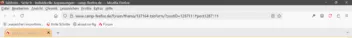
Hier nicht:
-
Hier nicht:
Komisch.
Ich integriere mal alle Werte und Farben ins CSS, damit die Testvoraussetzungen dann für alle gleich sind.
Erledigt.CSS
Alles anzeigen/*** Curved tabs beta D2b sauber - dunkles Theme ***/ /* aus #130 https://www.camp-firefox.de/forum/thema/137164-tabform/?postID=1239391#post1239391 */ /* Source = https://www.camp-firefox.de/forum/thema/137164-tabform/?postID=1287083#post1287083 */ /* -------------------------------------------------------------------------------------------------------------- */ :root { --uc-color-black-light: #2B2B2B !important; /* var(--uc-color-black-light) */ --uc-color-black-lighter: #404040 !important; /* var(--uc-color-black-lighter) */ --uc-color-grey-dark: #5C5C5C !important; /* var(--uc-color-grey-dark) */ --uc-color-grey-light: #A9A9A9 !important; /* var(--uc-color-grey-light) */ --uc-color-grey-lighter: #D4D4D4 !important; /* var(--uc-color-grey-lighter) */ --uc-color-white-dark: #E0E0E0 !important; /* var(--uc-color-white-dark) */ --uc-color-white-normal: #FFFFFF !important; /* var(--uc-color-white-normal) */ --uc-color-orange-normal: #FFAA00 !important; /* var(--uc-color-orange-normal) */ --uc-color-orange-hover: #FFCC66 !important; /* var(--uc-color-orange-hover) */ --uc-color-red-normal: #FF0000 !important; /* var(--uc-color-red-normal) */ --uc-color: rgba(225, 225, 225, 0.2); /* hellgrau basis, unselected */ --uc-color_hov: rgba(225, 225, 225, 0.3); /* mittelgrau unselected hover */ --uc-color-sel: rgba(255, 148, 0, 0.4); /* zart orange selected */ --uc-color-musel: rgba(255, 148, 0, 0.3); /* zart orange dunkel+ multiselected */ --uc-color_musel_hov: rgba(255, 148, 0, 0.5); /* zart orange dunkel+ multiselected hover */ --uc-color-orange-test: #db8b00 !important; } /* Border ---------------------------------------------------*/ :root { --uc-border-width: 3px !important; /* var(--uc-border-width) */ --uc-border-radius: 8px !important; /* var(--uc-border-radius) */ --uc-border-style: outset !important; /* var(--uc-border-style) */ /*--uc-radius: 20px !important;*/ --uc-radius: 19px !important; } /* Ränder ---------------------------------------------------*/ :root { --uc-margin-top: 3px !important; /* var(--uc-margin-top) */ --uc-margin-right: 10px !important; /* var(--uc-margin-right) */ --uc-margin-left: 1px !important; /* var(--uc-margin-left) */ --uc-margin-bottom: 5px !important; /* var(--uc-margin-bottom) */ } /* Abstände -------------------------------------------------*/ :root { --uc-padding-top: 3px !important; /* var(--uc-padding-top) */ --uc-padding-right: 20px !important; /* var(--uc-padding-right) */ --uc-padding-left: 20px !important; /* var(--uc-padding-left) */ --uc-padding-bottom: 3px !important; /* var(--uc-padding-bottom) */ --uc-block-margin: 2px !important; /* var(--uc-block-margin) */ --uc-min-height: 36px !important; /* var(--uc-min-height) */ } /* -------------------------------------------------------------------------------------------------------------- */ /*** General adjustments ***/ /*** Allgemeine Anpassunge ***/ :root { /* Tabs bar height adjust */ /* Tabbar Höhe einstellen */ /*--tabs-navbar-shadow-size: 0 !important;*/ /*--tab-block-margin: 4px !important;*/ --tab-block-margin: var(--uc-block-margin) !important; /* 2px */ --tab-min-height: var(--uc-min-height) !important; /* 36px */ /* Edges without corner Svg / Radius */ /* Kanten ohne Ecken (svg / Radien */ /*--ug-radius: 20px;*/ --ug-radius: var(--uc-radius) !important; /* 19px */ /* Edges (borders, outlines) colors */ /* Farben für Ränder (Umrandungen, Konturen) */ /* Edges not selected */ /* Ränder nicht ausgewählt */ /* --ug-color-border: hsla(0, 0%, 83%, 0.5); /* hellgrau unselected Kante Tab */ /* --ug-color-border: var(--uc-color-orange-test); */ --ug-color-border: var(--uc-color-grey-light); --ug-stroke: var(--ug-color-border); /* unselected Kante Svg */ /* --ug-kante_hova: hsla(0, 0%, 93%, 0.65); /* mittelgrau unselected alle Kanten hover */ --ug-kante_hova: var(--ug-color-border); /* Edges selected , multiselected */ /* Kanten ausgewählt, mehrfach ausgewählt */ /* --ug-color-border_select: hsla(0, 0%, 93%, 0.75); /* mittelgrau hell+ selected Kante Tab */ --ug-color-border_select: var(--uc-color-orange-normal); --ug-stroke_select: var(--ug-color-border_select); /* selected Kante Svg */ /* --ug-kante_hova_select: hsla(0, 0%, 100%, 0.8); /* mittelgrau hell++ multiselected alle Kanten hover */ --ug-kante_hova_select: var(--uc-color-orange-normal); /* Tabs background colors: */ /* --ug-color1: hsla(0, 0%, 83%, 0.25); /* hellgrau basis, unselected */ /* --ug-color2: hsla(35, 80%, 60%, 0.25); /* zart orange selected */ /* --ug-color2-multi: hsla(35, 80%, 40%, 0.25); /* zart orange dunkel+ multiselected */ /* --ug-color_multi_hova: hsla(35, 70%, 40%, 0.35); /* zart orange dunkel++ multiselected hover */ /* --ug-color_hova: hsla(0, 0%, 50%, 0.25); /* mittelgrau#2 unselected hover */ --ug-color1: var(--uc-color); /* hellgrau basis, unselected */ --ug-color2: var(--uc-color-sel); /* zart orange selected */ --ug-color2-multi: var(--uc-color-musel); /* zart orange dunkel+ multiselected */ --ug-color_hova: var(--uc-color_hov); /* mittelgrau unselected hover */ --ug-color_multi_hova: var(--uc-color_musel_hov); /* zart orange dunkel++ multiselected hover */ /* Tab bar unten, border bottom color */ /* --ug-color_bottom: hsla(0, 0%, 93%, 1); /* hellgrau nicht transparent, Kante unten */ --ug-color_bottom: var(--uc-color-orange-normal); /* Symbole für about:xxx */ --ug-color_tab-icon: var(--uc-color-red-normal); } /*** General adjustments end ***/ /* -------------------------------------------------------------------------------------------------------------- */ /* -------------------------------------------------------------------------------------------------------------- */ /*** Tabs base ***/ /* tabs connected bottom */ .tab-background { margin-block: calc(2 * var(--tab-block-margin)) 0 !important; } /*** Tabs Radien, borders, corners, tab shapes order , inline borders only where no custom corners ***/ /* Basis alle Tabs */ .tabbrowser-tab .tab-background { border-radius: var(--ug-radius) var(--ug-radius) var(--ug-radius) 0 !important; border: 1px solid !important; /*border-bottom: none !important;*/ } .tabbrowser-tab:not([pinned]) .tab-background { border-left: none !important; } /* Zusatzregeln, überschreiben Basis alle Tabs */ /* selected , pinned tabs */ .tabbrowser-tab:is([visuallyselected], [pinned]) .tab-background { border-radius: var(--ug-radius) var(--ug-radius) 0 0 !important; } /* Tab selected no inline border */ .tabbrowser-tab[visuallyselected]:not([pinned]) .tab-background { border-inline: none !important; } /* Tab after selected tab completely round, no corners */ .tabbrowser-tab:is([visuallyselected]):not([pinned]) + .tabbrowser-tab:not([visuallyselected]) .tab-background { border-radius: var(--ug-radius) !important; border-left: 1px solid var(--ug-color-border) !important; } /* Last tab dual corners, unless it comes after selected tab */ .tabbrowser-tab:not([pinned]):last-of-type .tab-background { border-radius: var(--ug-radius) var(--ug-radius) 0 0 !important; border-inline: none !important; } .tabbrowser-tab:is([visuallyselected]):not([pinned]) + .tabbrowser-tab:not([visuallyselected]):last-of-type .tab-background { border-radius: var(--ug-radius) var(--ug-radius) 0 var(--ug-radius) !important; border-right: none !important; } /* Erster Tab nach ausgewähltem Tab komplett rund, keine Ecken !! multiselected */ .tabbrowser-tab:is([visuallyselected]):not([pinned]) + .tabbrowser-tab:is([visuallyselected], [multiselected]) .tab-background { border-color: var(--uc-color-orange-normal) !important; } /*** COLORS ***/ /** In about:config set svg.context-properties.content.enabled to true **/ /* Basis alle Tabs */ .tabbrowser-tab .tab-background { outline: none !important; box-shadow: none !important; background-color: var(--ug-color1) !important; border-color: var(--ug-color-border) !important; stroke: var(--ug-stroke) !important; fill: var(--ug-color1) !important; border-bottom: none !important; /* Muss zusätzlich, da unten ja keine Kante sein soll ! */ } /* Zusatzregeln, überschreiben Basis alle Tabs */ /* Colors, outlines: selected / multiselected / hover */ /* tabs selected base */ .tabbrowser-tab:is([visuallyselected], [multiselected]) .tab-background { background-image: none !important; background-color: var(--ug-color2) !important; stroke: var(--ug-stroke_select) !important; border-color: var(--ug-color-border_select) !important; fill: var(--ug-color2) !important; } /* tabs multiselected */ .tabbrowser-tab:not([visuallyselected])[multiselected] .tab-background { background-color: var(--ug-color2-multi) !important; fill: var(--ug-color2-multi) !important; } /* tabs multiselected hover */ .tabbrowser-tab:not([visuallyselected]):hover .tab-background { background-color: var(--ug-color_multi_hova) !important; fill: var(--ug-color_multi_hova) !important; stroke: var(--ug-kante_hova_select) !important; border-color: var(--ug-kante_hova_select) !important; } /* tabs unselected hover */ .tabbrowser-tab:not([visuallyselected], [multiselected]):hover .tab-background { background-color: var(--ug-color_hova) !important; fill: var(--ug-color_hova) !important; stroke: var(--ug-kante_hova) !important; border-color: var(--ug-kante_hova) !important; } /* -------------------------------------------------------------------------------------------------------------- */ /* fill colors selected / unselected hover */ .tabbrowser-tab:is([visuallyselected], [multiselected]) .tab-background::before, .tabbrowser-tab:is([visuallyselected], [multiselected]) .tab-background::after { fill: var(--ug-color2) !important; stroke: var(--uc-color-orange-normal) !important; } .tabbrowser-tab:not([visuallyselected]):is([multiselected]) .tab-background::before, .tabbrowser-tab:not([visuallyselected]):is([multiselected]) .tab-background::after { fill: var(--ug-color2-multi) !important; } .tabbrowser-tab:not([visuallyselected]):is([multiselected]):hover .tab-background::before, .tabbrowser-tab:not([visuallyselected]):is([multiselected]):hover .tab-background::after { fill: var(--ug-color_multi_hova) !important; } /* right corner bg, selected --> vor not selected */ .tabbrowser-tab:is([visuallyselected]) + .tabbrowser-tab:not([visuallyselected]) .tab-background::before { background-image: none !important; } /* -------------------------------------------------------------------------------------------------------------- */ /*** tabs corners ***/ /* base */ #TabsToolbar { --ug-corner-size: var(--tab-min-height) !important; /* 36px */ --ug-corner-image: url("../icons/tab_corner.svg") !important; } .tabbrowser-tab .tab-background::before, .tabbrowser-tab .tab-background::after { -moz-context-properties: fill, fill-opacity, stroke, stroke-opacity !important; content: ""; position: absolute; width: var(--ug-corner-size) !important; height: var(--ug-corner-size) !important; background-size: var(--ug-corner-size) !important; background-repeat: no-repeat !important; background-position: bottom center !important; mask-image: linear-gradient(215deg, transparent, black 18px) !important; pointer-events: none !important; } /* left */ .tabbrowser-tab .tab-background::before { left: calc(0px - var(--ug-corner-size) / 2); /* -18px */ background-image: var(--ug-corner-image) !important; } /* right */ .tabbrowser-tab:is([visuallyselected], :last-of-type) .tab-background::after { right: calc(0px - var(--ug-corner-size) / 2); /* -18px */ background-image: var(--ug-corner-image) !important; transform: scaleX(-1) !important; } /**** Margins etc. overflow fix ****/ /* Base values ; tab padding, margin */ #tabbrowser-tabs { /* --ug-tab_Pad: calc(8px + var(--ug-corner-size) / 2); /* 26px */ --ug-tab_Pad: calc(-10px + var(--ug-corner-size) / 2); /* 8px */ /* --ug-tab_Marge: calc(0px - var(--ug-corner-size) - 12px); /* -48px */ --ug-tab_Marge: calc(0px - var(--ug-corner-size) / 2 + 6px); /* -12px */ } /* Basis all Tabs */ .tabbrowser-tab:not([pinned]) { overflow: visible !important; padding-inline: var(--ug-tab_Pad) !important; } /* Tab before any tab */ .tabbrowser-tab:not([pinned], [visuallyselected]) + .tabbrowser-tab:not([pinned]) { margin-inline: var(--ug-tab_Marge) 0px !important; /* margin-inline: -48px 0px !important; */ } /* Tab after selected */ .tabbrowser-tab:not([pinned]):is([visuallyselected]) + .tabbrowser-tab:not([pinned]) { margin-inline: var(--ug-tab_Marge) 0px !important; /* margin-inline: -48px 0px !important; */ } /* Tab selected */ .tabbrowser-tab:not([pinned]):is([visuallyselected], :last-of-type) { margin-inline: 0px !important; } /* Last tab after selected tab */ .tabbrowser-tab:is([visuallyselected]):not([pinned]) + .tabbrowser-tab:not([visuallyselected]):last-of-type { margin-inline: var(--ug-tab_Marge) 0px !important; /* margin-inline: -48px 0px !important; */ } /*** Tab left higher z index / Vorrang vor Tab rechts ***/ .tabbrowser-tab:not([pinned]) .tab-content { z-index: 1 !important; } /*** Space for corner left/right - first/last tab, overflow bugs fix ***/ #tabbrowser-tabs .tabbrowser-tab:nth-child(1 of :not([pinned], [hidden])) { /* margin-inline-start: 0px !important; */ margin-inline-start: 10px !important; } #tabbrowser-tabs:not([pinned]) .tabbrowser-tab:last-of-type { /* margin-inline-start: 0px !important; */ margin-inline-end: 10px !important; } #tabbrowser-tabs[overflow]:not([movingtab]) .tabbrowser-tab:nth-child(1 of :not([pinned], [hidden])) { margin-inline-start: -12px !important; } #tabbrowser-tabs[overflow]:not([movingtab]) .tabbrowser-tab:last-of-type { margin-inline-end: -12px !important; } /*-----------------------------------------------*/ /**** Tabtext nicht verkürzt bei hover ****/ /*-----------------------------------------------*/ /* Ein längerer Tabtext wird am Ende ja ausgeblendet. */ /* Diese Verkürzung bei hover hätte ich gerne verhindert. */ .tabbrowser-tab:not(:hover) > .tab-stack > .tab-content > .tab-close-button { padding-inline-start: 6px !important; width: 24px !important; } .tabbrowser-tab[visuallyselected=true]:not(:hover), #tabbrowser-tabs:not([closebuttons=activetab]) > #tabbrowser-arrowscrollbox > .tabbrowser-tab:not([visuallyselected=true]):not(:hover) { --tab-label-mask-size: 1em !important; } /* Tabtext wird nicht ausgeblendet */ .tab-label-container[textoverflow][labeldirection=ltr]:not([pinned]), .tab-label-container[textoverflow]:not([labeldirection]):not([pinned]):-moz-locale-dir(ltr) { mask-image: none !important; } /*--------------------------------------------*/ /**** Tabbar nach unten verschieben ****/ /*--------------------------------------------*/ #navigator-toolbox { position: relative !important; padding-bottom: calc( var(--tab-min-height) + 8px ); /* 44px */ /* padding-bottom: 42px !important; */ } #TabsToolbar { position: absolute !important; display: block !important; } /*--------------------------------------------------*/ /**** Trennlinie zwischen Inhalt und Tableiste ****/ /*--------------------------------------------------*/ #TabsToolbar { bottom: 6px !important; /* Tableiste etwas angehoben */ width: 100vw !important; /* Tableistenbreite festgelegt */ background-image: linear-gradient(to top, var(--ug-color_bottom) 7px, transparent 1px) !important; margin-bottom: -7px !important; /* Trennlinie nach unten verschoben */ padding-bottom: 7px !important; /* Tabs etwas angehoben */ } /*---------------------------------------------*/ /**** Symbole für about:xxx anpassen ****/ /*---------------------------------------------*/ .tab-icon-image { -moz-context-properties: fill !important; /* fill: #FFAA00 !important; */ fill: #FF0000 !important; } /*-----------------------------------------------------------------------*/ /* Ausblenden des Meüs "Link in neuem Tab in Umgebung öffnen" im Popoup **/ /*-----------------------------------------------------------------------*/ #context_reopenInContainer { display: none !important; } /*---------------------------------------------------*/ /************** Tab schließen X hover ***************/ /*---------------------------------------------------*/ .tabbrowser-tab:not([pinned]) .tab-close-button { /* Button rund */ border-radius: 50% !important; display: flex !important; } .tab-content > .tab-close-button:hover { /*outline: none !important;*/ outline: 1px solid rgba(255, 0, 0, 0.3) !important; outline-offset: -1px !important; background-color: rgba(255, 0, 0, 0.4) !important; /* Rot */ box-shadow: 0 0 1em rgba(255, 0, 0, 0.7) !important; /* Rot, glow */ } /* Schließen Kreuz größer */ .tab-close-button { transform: scale(1.4, 1.4) !important; } /*---------------------------------------------------*/ /************* New Tab Button (+) hover *************/ /*---------------------------------------------------*/ /* Abstand vom Tab */ #tabbrowser-arrowscrollbox-periphery #tabs-newtab-button .toolbarbutton-icon { margin-left: 6px !important; border-radius: 50% !important; } /* New Tab (+) button hover outline */ #tabbrowser-arrowscrollbox-periphery:hover #tabs-newtab-button .toolbarbutton-icon { outline: 1px solid var(--uc-color-orange-normal) !important; outline-offset: -1px !important; background-color: var(--ug-color1) !important; } /* New Tab (+) button hover color */ #tabbrowser-arrowscrollbox-periphery:hover #tabs-newtab-button:hover { fill: var(--uc-color-orange-normal) !important; } /* Position, closer to last tab */ #tabbrowser-arrowscrollbox-periphery #tabs-newtab-button { margin: 0 !important; margin-top: 2px !important; padding-inline: 0px !important; } .tabbrowser-tab:not([pinned]) + #tabbrowser-arrowscrollbox-periphery { margin-left: -16px !important; z-index: 2 !important; } /*-------------------------------------------------*/ /*************** Schrift in den Tabs ***************/ /*-------------------------------------------------*/ .tab-label { overflow: hidden !important; text-overflow: ellipsis !important; /* text-overflow: " " !important; */ text-overflow: " …" !important; white-space: nowrap !important; max-width: 95% !important; text-shadow: 1px 1px 1.5px var(--uc-color-black-light) !important; /* Schatten hinter Schrift */ } .tab-label[selected] { color: var(--uc-color-white-normal) !important; /* Aktiver Tab: Schriftfarbe (Orange) */ } .tab-label:not([selected]) { color: var(--uc-color-grey-lighter) !important; /* Aktiver Tab: Schriftfarbe (Hellgrau) */ } /* Move tab content */ .tab-content { margin-top: 1px !important; } /*************** Tests ***************/ #tabbrowser-tabs { /* --tab-min-width: 76px !important; */ --tab-min-width: 75px !important; --tab-loading-fill: lime !important; --tab-overflow-pinned-tabs-width: 0px !important; } /* userChrome.css */ /* progress-bar page loading in the tab header */ .tabbrowser-tab:not([usercontextid]) > .tab-stack > .tab-background > .tab-context-line { opacity: 0; background-color: #FFCC00; height: 2px; margin-inline: 12px; margin-top: 0px; border-radius: 90px; } .tabbrowser-tab:is([busy], [progress]) > .tab-stack > .tab-background > .tab-context-line { opacity: 1; transform-origin: left center; animation: 2s ease-in-out scale; } .tabbrowser-tab[bursting] > .tab-stack > .tab-background > .tab-context-line { transition: opacity 2s ease-out; } @keyframes scale { 0% {transform: scaleX(0);} 100% {transform: scaleX(1);} }Wenn es jetzt immer noch nicht passt, dann verstehe ich's nicht!
Habe es in einem neuen, sauberen Testprofil mir angeschaut, alles so, wie es sein soll,
ob mit oder ohne Menüleiste, egal.
AH, Titelleiste!!!
Ja, Scheibenkleister, ja die muss aktiviert sein. -

Beitrag von Horstmann (
22. März 2026 um 17:51 )Dieser Beitrag wurde vom Autor gelöscht (22. März 2026 um 18:12 ). -
Oh Mann, dieser alte Mist Code schon wieder:
In #165, Zeile 379 abwärts, das Tabbar nach unten verschieben Zeug.
Hat noch nie sauber funktioniert, sowas kann man einfach nicht öffentlich verbreiten.
-
AH, Titelleiste!!!
oder die Menüleiste.
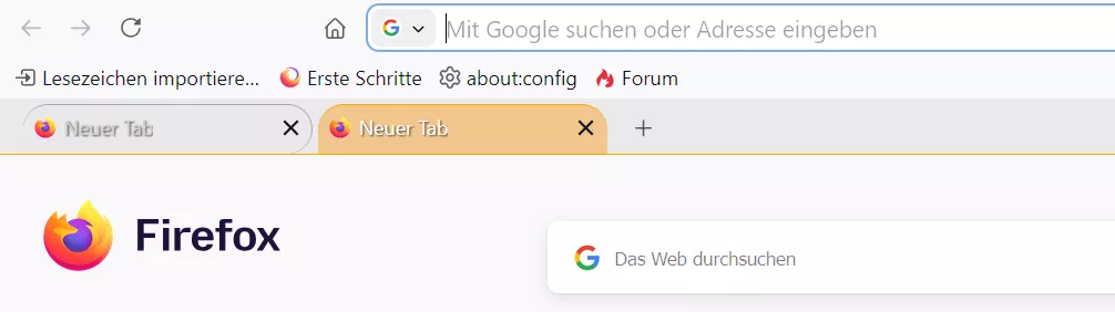
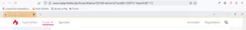
So ohne, aber mit Titelleiste:
Und so ohne die beiden Leisten:
-
Also ich muss eine andere Möglichkeit finden, die Tableiste nach unten zu bekommen!
Bisher:Aber dann kommt eben das "Kuddelmuddel" raus, wenn die Titelleiste deaktiviert ist.
Der andere Code kann ja bleiben, denn er schafft ja nur den Platz.CSS#navigator-toolbox { position: relative !important; padding-bottom: calc( var(--tab-min-height) + 8px ); /* 44px */ }Zum Testen in einem neuen, sauberen Profil, habe ich im übrigen auch MOG's css getestet, gleiches Problem,
was ja bedeutet, dass es wirklich nur an CodeOh Mann, der alte Mist Code schon wieder:
In #165, Zeile 379 abwärts, das Tabbar nach unten verschieben Zeug.
liegt.
Es muss also eine andere Möglichkeit her, oder wie Sören Hentzschel schon schrieb, muss das in den Header hineingeschrieben werden.
Eine andere bessere Möglichkeit die Tabs nach unten zu bekommen wäre aber schon schöner. -
eine andere Möglichkeit finden, die Tableiste nach unten zu bekommen!
Teste bitte:
BeitragTableiste unten per CSS-Code, oder per Skript.
Mit diesem Code ist die Tableiste wieder unter der Lesezeichensymbolleiste.
(Quelltext, 17 Zeilen)
Hat man die Titel- und Menüleiste ausgeblendet, und möchte die Button zum Schließen etc. aber in der Navbar haben, dann muss man das zusätzlich einfügen in den Code:
(Quelltext, 7 Zeilen)
Sieht dann so aus:

Wichtiger Hinweis:
Bei einigen Nutzern des Codes tritt ein mir unbekannter Fehler auf.
Und zwar wird der Raum nicht wieder freigegeben, wenn mittlere Tabs geschlossen werden.
Das passiert wohl oft… 2002Andreas7. Dezember 2019 um 18:38 -
-
2002Andreas Das funktioniert, nur dann verschieben sich die "Fensterbuttons" halt leider auch!
"Fensterbuttons" => min, max, schließen
Muss doch eine Möglichkeit geben nur die Tableise zu verschieben.
Und dass die #TabsToolbar.browser-toolbar.browser-titlebar hbox.titlebar-buttonbox-container hbox.titlebar-buttonbox
an Ort und Stelle verbleibt
und nur #TabsToolbar.browser-toolbar.browser-titlebar hbox.toolbar-items hbox#TabsToolbar-customization-target.customization-target tabs#tabbrowser-tabs arrowscrollbox#tabbrowser-arrowscrollbox verschoben wird. -
dann verschieben sich die "Fensterbuttons" halt leider auch!
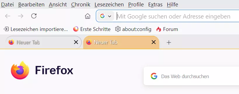
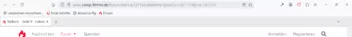
So mit Menüleiste:

So mit Titelleiste:
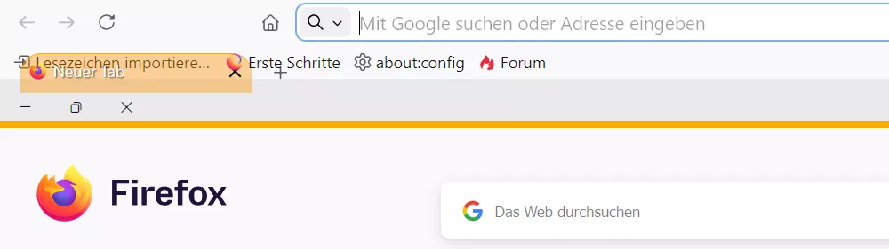
Und so ohne die beiden Leisten:
Und so ohne deinen Code:

-
Also ich muss eine andere Möglichkeit finden, die Tableiste nach unten zu bekommen!
Eine andere bessere Möglichkeit die Tabs nach unten zu bekommen wäre aber schon schöner.Inklusive Provisorien für die Platzierung der Window Control Buttons, von einer kompetenteren Quelle, sowas.
Wenn man Leisten, oder überhaupt irgendwas, absolute oder fixed positionieren, oder sonstwie das Basis Layout manipulieren will, könnte man idealerweise etwas testen.

-
Muss doch eine Möglichkeit geben nur die Tableise zu verschieben.
Evtl. so:
-
Ich und CSS.
Danke @Horstmann
Anstatt :
CSS#navigator-toolbox { position: relative !important; padding-bottom: calc( var(--tab-min-height) + 8px ); } #TabsToolbar { position: absolute !important; display: block !important; }nutze ich jetzt dies:
CSS
Alles anzeigen@media not -moz-pref("sidebar.verticalTabs") { .global-notificationbox, #tab-notification-deck, #notifications-toolbar, #TabsToolbar { order: 1; } #TabsToolbar > :is(.titlebar-spacer,.titlebar-buttonbox-container) { display: none; } :root[customtitlebar] #toolbar-menubar:is([autohide=""],[autohide="true"],[collapsed]) ~ #nav-bar { > .titlebar-buttonbox-container { display: flex !important; } :root[sizemode="normal"] & { > .titlebar-spacer { display: flex !important; } } :root[sizemode="maximized"] & { > .titlebar-spacer[type="post-tabs"] { display: flex !important; } } } }Keine Ahnung, was ich da fabriziert habe, aber es funktioniert genau so, wie ich es mir vorstellte.
Wenn keine Titelleiste und auch keine Menüleiste angezeigt wird, sind dennoch die Fensterbuttons oben rechts in der Ecke.
-
oben rechts in der Ecke.
Siehe auch Beitrag Nr. 175.
Aber du musst das für dich entscheiden was dir lieber ist.
-
OH, 2002Andreas
Das ist ja noch besser, weil nicht so komplex!
Das werde ich übernehmen.
-
Das werde ich übernehmen.
Du musst natürlich testen, ob es damit an anderer Stelle evtl. ein Problem geben könnte. Das habe ich hier nicht weiter überprüft.
weil nicht so komplex!
Ich versuche immer erstmal möglichst wenig Code zu nutzen.
-
Evtl. so:
So sollte es auch gehen.
-