Manche Dinge erledigen sich vermutlich von allein:

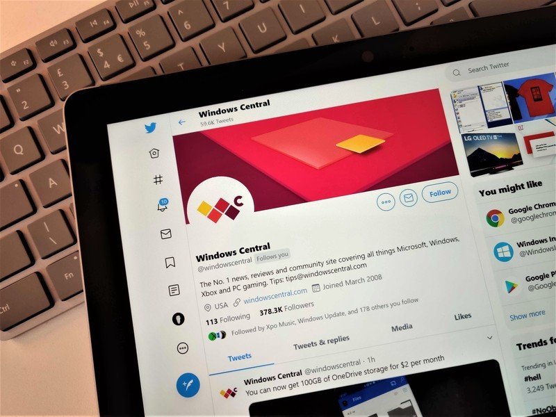
Last week Twitter started rolling out its new Chirp font across its apps, including the one on Windows 10. While Twitter designed the font to be legible and have good density, an issue on Windows 10 made characters difficult to read. Twitter has identified the issue and is working on a fix.
We've identified issues with the Chirp font for Windows users and are actively working on a fix. Thanks for your patience and please let us know if you have additional feedback.
— Twitter Accessibility (@TwitterA11y) August 14, 2021While the issue on Windows 10 appears to make the Chirp font look worse than Twitter wants it to, many dislike the design of the font, even when rendered properly.
It's still painful. I want an anti-aliased font, not a "clean edged" font that belongs on printed paper. I'm sick of print typographer purists imposing their aesthetic sense on digital products. Not a single person on this font has experience in digital typography/ why
— Cullen (@cullend) August 15, 2021
The Chirp font is too monotonous and makes it difficult to read. x-height also seems to be small.
Why not give users the choice of selecting their own font? There are plenty on Google Fonts.
— Aravind (@aravind_mobile) August 15, 2021


