

Wurdest Du nicht aufgefordert ganze Skripte zu posten?
Nun fangt doch nicht schon wieder damit an, das nervt ja langsam. Aber du hast ja nicht ganz Unrecht, bitteschön.
Unglaublich ....
Wurdest Du nicht aufgefordert ganze Skripte zu posten?
Nun fangt doch nicht schon wieder damit an, das nervt ja langsam. Aber du hast ja nicht ganz Unrecht, bitteschön.
Unglaublich ....
Ich bitte in der Sache nochmals um Hilfe. Im Beitrag #1 ist der zweite Codee für Hoover vorhanden, was bis zur Version 138 für jeden einzelnen Button den roten Pfeil bringt. Sieht dann so aus:
In Version 139/140 will mir das nicht gelingen, es auch dort so einzurichten. Wenn ich z.B. diesen Code dafür einsetze, so werden alle Button gleichzeitig angesprochen.
CSS/*rechts der kleine Pfeil bei hoover*/ #ExtraConfigMenu-popup:hover > menu::after { content: "" !important; background-image: url("..//icons/down2.png") !important; margin-right: 12px !important; display: block !important; background-repeat: no-repeat !important; background-position: 0px 3px !important; background-size: 14px 14px !important; }Was dann so aussieht:
Witzig, sowas in der Art habe ich erwartet.
Das hat vielleicht etwas mit CSS Selektoren/Combinators zu tun; aber zum Glück findet sich die Lösung an jeder Ecke. 
Einfach das Combinator Dingens googeln, wie das geht mit Pseudoelelementen oder eben nicht, und in den Browserwerkzeugen schauen was die CSS Pfade etc. sind für den ganzen Kram.
Das Script einzustellen hälst du ja für unnötig, also selber ran! 
Oder mal sowas wie #ExtraConfigMenu-popup > menu:hover menu::after testen, mit oder ohne > ... 
Script aus #2
Aber es funktioniert in der Nightly.
Danke für's Testen! 
Dass deine Version in verschiedenen Fenstern klappt, ohne das beschriebene Problem, ist seltsam; bei mir könnte es ja ein Mac Problem sein, aber die jüngsten Meldungen dazu kamen von Windows Usern.

2002Andreas : das Bild liegt bei mir C:\Users\geldh\AppData\Roaming\Mozilla\Firefox\Profiles\rq9bmbv4.xxxxxxxx\chrome\Icons\A.png
Das einzige was mir zusätzlich zu den obigen Kommentaren noch einfällt, ist dass Icons bei dir mit grossem I geschrieben ist, als Name des Icon Ordners; im Script ist es icons kleingeschrieben.
Wobei das nicht in jedem Fall ein Problem sein muss, ich meine mich zu erinnern dass hier am Mac Dateipfade nicht case-sensitive sind, oder sind es nur Dateinamen?
Oder, Dein Skript "repariert".
Nur aus Neugierde, ist da etwas anders als in meinem Script aus #2, oder hatte ich da einen Fehler drin?
Sieht für meinen Eindruck eigentlich gleich aus.
Und hast du das in der Release, und auch in der berüchtigten Nightly  getestet?
Horstmann : leider keine Funktion
Mira_Belle : leider kein Button
Hast du mit Mira's Version die Funktion, nur evtl. einen unsichtbaren Button?
Siehe hier.
Mal testen bitte:
// buttonCloseTab.uc.js - Button > Firefox Tabs schliessen

  (function() {

  if (!window.gBrowser) return;

    try {
        CustomizableUI.createWidget({
            id: 'fp-closetabs',
            type: 'custom',
            defaultArea: CustomizableUI.AREA_NAVBAR,
            onBuild: function(aDocument) {
                var toolbaritem = aDocument.createElementNS('http://www.mozilla.org/keymaster/gatekeeper/there.is.only.xul', 'toolbarbutton');
                var props = {
                    id: 'fp-closetabs',
                    class: 'toolbarbutton-1 chromeclass-toolbar-additional',
                    label: 'Aktuellen Tab schließen',
                    tooltiptext: 'Aktuellen Tab schließen',
                    style: 'list-style-image: url(\'data:image/svg+xml;charset=utf-8,<svg xmlns="http://www.w3.org/2000/svg" color="dodgerblue" width="12" height="12" viewBox="0 0 16 16"><path fill="currentColor" fill-opacity="context-fill-opacity" d="M9.414 8l5.293-5.293a1 1 0 0 0-1.414-1.414L8 6.586 2.707 1.293a1 1 0 0 0-1.414 1.414L6.586 8l-5.293 5.293a1 1 0 1 0 1.414 1.414L8 9.414l5.293 5.293a1 1 0 0 0 1.414-1.414z"></path></svg>\')',
                   // onclick: 'if (event.button == 0) { \
                        //    BrowserCommands.closeTabOrWindow();\
                          //       }; '
                };
                for (var p in props)
                    toolbaritem.setAttribute(p, props[p]);
					//toolbaritem.addEventListener('click', event => {
					//if (event.button == 0) {
                    //       BrowserCommands.closeTabOrWindow();
                    //      };
					//});
                return toolbaritem;
            }
        });
    } catch(e) { };

    // Fix #2
    document.getElementById('fp-closetabs').addEventListener('click', event => {
        if (event.button === 0) {
             BrowserCommands.closeTabOrWindow();
         }
     });

})();
Alles anzeigen
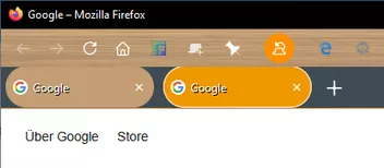
jetzt werden die TABS oben zu weit reingeschoben irgendwie.
Der Abstand zwischen den TABs ist auch noch zu weit
unten paßt das perfekt !
Kannst du mir bitte sagen wo du da was geändert hast, damit ich die zahlen mal versuchen kann ?
Falls die Antwort für mich bestimmt war (?):
Damit könnste spielen, im gleichen CSS Code den du vorher mit diesem CSS probiert hast.
Funktioniert nicht mit dem neuen Komplett-CSS von #1008, das du stattdessen auch testen kannst.
/* Abstand zw. Tabs anpassen */
.tabbrowser-tab:not([pinned]) {
    padding-inline: 2px !important;
}

/* Abstand Tabs top:oben bottom:unten anpassen */
.tab-background {
    margin-top: 2px !important;
    margin-bottom: 1px !important;
}aber die Höhe ist hier normal eigentlich nur 35px
Höhe normal: 36px .
Das geht nicht, wenn ich da ganz unten ans Ende einfüge, dann ist die TAB-Leiste wieder über der Adressleiste, wo soll das denn rein genau in welche Datei ?
.........
0% Abstand über dem TAB und 0% Abstand unter dem TAB bitte bitte
In die userChrome.css Datei, da wo du auch den CSS Code von Andreas benutzt.
Nicht in die JS Datei, schnell wieder rauslöschen von da! 
Was auch ginge, aber mit dem Code will ich nix zu tun haben.
Hi, ersetze Zeilen 46 bis einschl. 54 mit ...
Das ist allerdings die Fix Version #1, die meist nur für bzw. in einem einzigen Fenster funktioniert, abhängig von der benutzten Funktion natürlich.
Mach mal ein zweites Fenster auf, und Klick den Button in deiner Version- die Seite öffnet sich im zuerst geöffneten Fx Fenster, und nur dort, jedenfalls bei mir.
Da kann ich mir aber den Mund fusselig reden, das scheint nicht relevant zu sein.
Probier mal den Otto:
/* aboutabout_ToolbarButton.uc.js */
//  aboutabout-button.uc.js

  (function() {

       var css =`
    #aboutabout-ToolBarButton > image {
    display: none !important;
}

#aboutabout-ToolBarButton > label {
    display: flex !important;
    background-color: lightgreen !important;
    color: red !important;
    outline: 1px solid red !important;
    outline-offset: -1px !important;
}

#aboutabout-ToolBarButton:hover > label {
    background-color: green !important;
    color: cyan !important;
    outline: 1px solid purple !important;
    outline-offset: -1px !important;
}
  `;

  var sss = Cc['@mozilla.org/content/style-sheet-service;1'].getService(Ci.nsIStyleSheetService);
  var uri = makeURI('data:text/css;charset=UTF=8,' + encodeURIComponent(css));
  sss.loadAndRegisterSheet(uri, sss.AUTHOR_SHEET);

   if (location != 'chrome://browser/content/browser.xhtml') return;

    try {
        CustomizableUI.createWidget({
            id: 'aboutabout-ToolBarButton',
            type: 'custom',
            defaultArea: CustomizableUI.AREA_NAVBAR,
            onBuild: function(aDocument) {
                var toolbaritem = aDocument.createElementNS('http://www.mozilla.org/keymaster/gatekeeper/there.is.only.xul', 'toolbarbutton');
                var props = {
                    id: 'aboutabout-ToolBarButton',
                    class: 'toolbarbutton-1 chromeclass-toolbar-additional',
                    label: 'About:About',
                    tooltiptext: 'About:About',
                    /* style: 'list-style-image: ', */
                    //onclick: 'if (event.button == 0) { \
                    //                    openTrustedLinkIn("about:about", "tab");\
                    //             }; '
                };
                for (var p in props)
                    toolbaritem.setAttribute(p, props[p]);
                return toolbaritem;
            }
        });
    } catch(e) { };

    document.getElementById('aboutabout-ToolBarButton').addEventListener('click', event => {
    if (event.button === 0) {
         openTrustedLinkIn("about:about", "tab");
        }
    });

})();Jetzt bruahc ich nur noch den Abstand der TAB der soll 0 sein oben und unten 0 un zueinender bitte 5px
Ich steig da nicht durch, aber probier mal ganz grob in der CSS Datei das dazu, am besten unten:
Ich möchte CODe hier posten wie geht das möchte nicht immer alles umwandeln udn kopieren udn so das ist umständlich Ich möchte gerne den CODE reinstellen wie ander eauch hier im Forum
So ==>
Es lag aber nicht zwingend an dem Script, denn darin hat sich nichts geändert. Gibt es hier im Forum an jeder Ecke.
......Danke, das hat mich jetzt auf die Lösung gebracht, denn content fehlte, und es muss jetzt dazu background-image heißen.
Damit funktioniert es dann wieder;
menu::after hat eigentlich schon content: "" , ist im Fx Code, ist aber evtl. abhängig vom Script .... 
Und generell: wenn dich mehrere Leute auffordern das Script zu posten, dann würde ich es einfach machen an deiner Stelle, schon deshalb weil die Zusammenhänge nicht nur dir nicht immer klar sind.
Was ich grundsätzlich vermeiden würde, ist der Vorschlag an Helfer sich das Ding gefälligst selber an jeder Ecke zu suchen, hinterlässt einen etwas faden Geschmack.
Du könntest mal schauen, ob sich damit irgend etwas tut; aber wie erwähnt, das Script sollte man schon sehen, das ist nicht unbedingt Allgemeinwissen.
Wie ebenfalls erwähnt, ist .menu-right jetzt wohl menu::after, und hat einen anderen Pfad, irgendwie sowas.

Seit geraumer Zeit verfolge ich die Anfragen, und auch, wenn ihr auf persönliche Scripte eingehen müsste - oder wollt. Schafft endlich wieder eine Basis! Ich bau auf euch!
Hmm, sehr gute Idee, das ist hier dann doch etwas übersichtlich...
Webmark mag keine Scherze, schon gar nicht, wenn es um ihn geht.
Das war mein Eindruck, ergo ... 
Und natürlich musste ich dir zur Seite eilen!
www.camp-firefox.de##.post > .inner:contains(Webmark) u.ä.
Jedwelche Form von User ignorieren Funktion, da bin ich ein strikter Gegner von.
Ich vermute es ging wohl nicht anders, aber daß existierende Profile (anscheinend?) nicht in die neue Profilverwaltung übernommen werden können ist schon etwas ein Dämpfer.
Wird wohl schnell eine Möglichkeit gefunden werden das manuell oder sonstwie zu erledigen, und das Ganze muss man sich ja auch erstmal anschauen, aber bis dahin ist das Feature erstmal für die Katz. 
Separate Icons sind aber schon mal prima, und bestimmt kann man Profile dann auch einzeln mit Passwörtern sperren.

Danke, aber ich vermeide es händisch einzugreifen.
Zu oft auf die Pfoten bekommen?


Bei mir funktionieren alle Skripte.
Hier auch. (Wir haben ja auch vorgearbeitet...)
Huh, wie vorgearbeitet?
Oder meinst du die ganzen JS Anpassungen über die letzte Zeit?

Ganz ehrlich: ich verstehe nicht, warum man die ganze Sache so furchtbar dramatisieren muss und warum alles schon wieder "zerredet" wird, bevor überhaupt eine Zeile Code existiert?
War doch nur ein Gedanke zum Thema, es steht ja auch in der Rubrik Smalltalk; ich dachte das suggeriert einen Diskussionswunsch.
Hier kann doch jeder coden was er will, also nur zu!
Noch etwas: Wir hatten schon oft den Fall, dass die Vorbereitungen für die User-Skripte nicht richtig durchgeführt wurden. Woran das jetzt lag ist unerheblich. Und es wurde teilweise viel Zeit aufgewendet, um herauszubekommen, ob Skripte bei dem entsprechenden User allgemein nicht laufen oder etwas an einem bestimmten Skript hakt. Wenn es ein funktionierendes PS-Skript dafür gibt, wäre das sicher ein Fortschritt. Außerdem lässt sich das Skript dazu nutzen, sowohl 'userChrome.css', 'userContent.css' und die Shadow-Geschichte bereits zu integrieren. Außerdem kann man das Skript später einmal so erweitern, dass bestimmte Sachen "standardisiert" werden, wie z.B. ein einheitliches Verzeichnis für Image/Icon-Dateien.
Wall of text, Sent from my iPhone?
Was ich hier sehe, ist eine Komprimierung von potentiellen Fehlerquellen in ein Konstrukt mit hohem Aufwand für Troubleshooting.
Wenn man jetzt noch bedenkt, daß dieses Konzept einen weiten Bereich von konstant weiterentwickeltem Firefox Code einschliesst, systemübergreifend funktionieren müsste, und jemand die Geschichte permanent warten und anpassen müsste...
Viele weniger engagierte User haben generell schon Schwierigkeiten damit eine Problembeschreibung sinnvoll zu formulieren, und schleppen oft redundanten und/oder alten Code mit; wo setzt man an wenn sich die Quelle nicht mal eingrenzen lässt?
Wir reden hier ja über die Manipulation von einem global integriertem Internet Browser.
Ich bin da eher mit Sören Hentzschel ; Aufwand gering halten, um möglichst vielen Usern den Zugang zu ermöglichen; aber auch ein Minimum an Initiative voraussetzen.
Das kann m.E. Komplexität drastisch reduzieren, für User die Code erstellen oder Probleme zu lösen versuchen, und für User die nach Problemlösungen suchen.
Meine eigenen bescheidenen Bemühungen sind oft dominiert von möglichst einfacher Bedienbarkeit, deshalb unnötig kompliziert für andere User - und anfälliger für Fehler und Code Updates.
Es gibt ja auch eine Unzahl von Erweiterungen und Themes via Mozilla, niemand ist gezwungen für Fx Modifikationen diesen letzten Schritt zu gehen.
Eine low-tech Alternative wäre evtl. ein erweitertes, standardisiertes ReadMe , wie zB du und 2002Andreas es schon in den gepinnten Threads anbieten.