


Vor sechs Jahren waren Abstände im Design genauso via userChrome.css anzupassen wie heute.
Gab es vor 6 Jahren nicht schon die Erweiterung Stylish, mit der man, was heutzutage ja nicht mehr geht, auch auf das GUI von Fx zugreifen konnte?
Vor sechs Jahren waren Abstände im Design genauso via userChrome.css anzupassen wie heute.
Gab es vor 6 Jahren nicht schon die Erweiterung Stylish, mit der man, was heutzutage ja nicht mehr geht, auch auf das GUI von Fx zugreifen konnte?
Hallo StandingBill,
teste mal das ↓ in der userChrome.css.

Na dann fliegt der Firefox eben vom Rechner. Dann muss ich eben doch den von mir ungeliebten Chrome nutzen.
Was soll das denn? Es wird doch daran gearbeitet, also einfach mal ein paar Tage warten.

Weiter unten steht auch eine Antwort von F-Secure
We are currently working with Mozilla to solve this issue. Meanwhile, we recommend that you use either Microsoft Edge or Google Chrome browser until the issue has been fixed.
Sprich F-Secure arbeitet an dem Problem.

Wenn ich z.B. Strg+Shift+E drücke erscheint keine Möglichkeit der Gruppierung.
Die gibt es auch nicht mehr, Du musst auf #AMO nach groups suchen, um eine passende Erweiterung zu finden.

Hinweis, es schaltet nur in about:config den entsprechenden Eintrag
Müsste es nicht auch in about:preferences zu sehen sein?
Das wäre meine Version vom Script:
Das Script Funktioniert hier nicht.
Das BSI hat auch schon vor Firefox und Thunderbird gewarnt.
Aber doch wohl nicht generell, sondern wegen einer Sicherheitslücke, oder?
Nur mal so, falls es noch keiner gelesen haben sollte.
Kommt die Warnung nicht etwas spät?

Wie kann die Speicherfähigkeit wieder hergestellt werden?
Hm, hier gibt kein Problem mit dem Speichern, Betriebssystem ist hier allerdings Windows 10.

Hier sollten die beiden rot markierten Einträge "Löschen" und "Schnellzugriffsliste leeren" aus dem Kontextmenü entfernt werden.
Der Rest sollte dann anders sortiert werden
Guten Morgen,
soweit habe ich es hinbekommen, wie man allerdings zusätzliche Trennlinien einfügt, weiß ich nicht.
menupopup {
    appearance: none !important;
}

.downloadDeleteFileMenuItem,
#downloadsContextMenu menuitem[label="Schnellzugriffsliste leeren"] {
  display: none !important;
}

.downloadRemoveFromHistoryMenuItem {
  -moz-box-ordinal-group: 1 !important;
}
.downloadCommandsSeparator {
  -moz-box-ordinal-group: 2 !important;
  margin-top: 5px !important;
  margin-bottom: 4px !important;
}
.downloadCopyLocationMenuItem {
  -moz-box-ordinal-group: 3 !important;
}
.downloadShowMenuItem {
  -moz-box-ordinal-group: 4 !important;
}
.downloadOpenReferrerMenuItem {
  -moz-box-ordinal-group: 5 !important;
}
#downloadsContextMenu > menuseparator:nth-child(11) {
  -moz-box-ordinal-group: 6 !important;
  margin-top: 5px !important;
  margin-bottom: 4px !important;
}
.downloadAlwaysOpenSimilarFilesMenuItem {
  -moz-box-ordinal-group: 7 !important;
}Der zweite Code.
Ok, damit weiß ich für die Zukunft Bescheid, Dankeschön.
Nein. Der Teil ist bei dir doch überhaupt nicht Teil deiner Handlers-Richtlinie, nicht einmal vom policies-Objekt. Das wird also komplett ignoriert, weil Firefox damit nichts anfangen kann. Der "bin"-Block gehört auf die gleiche Ebene wie der "exe"-Block.
Also so ↓?
{
  "policies": {
    "DisablePocket": true,
    "DisableFirefoxStudies": true,
    "DisableFirefoxAccounts": true,
    "DisableBuiltinPDFViewer": true,
    "Handlers": {
      "extensions": {
      "exe": {
          "action": "saveToDisk",
          "ask": true
        }
      },
      "extensions": {
      "bin": {
          "action": "saveToDisk",
          "ask": true
        }
      },
      "extensions": {
      "com": {
          "action": "saveToDisk",
          "ask": true
        }
      }
    }
  }
}Oder so ↓?
{
  "policies": {
    "DisablePocket": true,
    "DisableFirefoxStudies": true,
    "DisableFirefoxAccounts": true,
    "DisableBuiltinPDFViewer": true,
    "Handlers": {
      "extensions": {
      "exe": {
          "action": "saveToDisk",
          "ask": true
        },
      "bin": {
          "action": "saveToDisk",
          "ask": true
        },
      "com": {
          "action": "saveToDisk",
          "ask": true
        }
      }
    }
  }
}
Hättest du oben vielleicht dazu schreiben sollen...
Da ging es ja nur ums zusammenfügen und nicht um Rechtschreibfehler. ![]()
Allein wegen der Rechtschreibfehler wohl eher nicht...
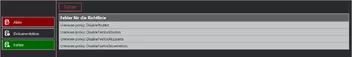
Die sind absichtlich eingefügt, nur so kann man sehen, ob die Anpassungen für meine about-policies.css vollständig und korrekt sind.
Gerne doch.
Guten Morgen und schönes Wochenende,
wäre das so ↓ zusammengefügt richtig?
{
  "policies": {
    "DisablePocket": false,
    "DisableFirefoxStudies": false,
    "DisableFirefoxAccounts": false,
    "DisableFirefoxScreenshots": false,
    "DisablePocktet": false,
    "DisableFirefoxSttudies": false,
    "DisableFirefoxAtccounts": false,
    "DisableFirefoxStcreenshots": false
    "Handlers": {
      "extensions":{
        "exe": {
          "action": "saveToDisk",
          "ask": true,
          "handlers":[
            {}
          ]
        }
      }
    }
  }
}Der vorhandene policies-Teil ist nur zum Testen der Formatierung der CSS-Anpassungen für die about-policies.css.
 CSS
CSS/* Kontextmenu auf webseite */ /* Sollte so sein wie beim appmenü*/ #contentAreaContextMenu > menuitem, #contentAreaContextMenu > menu { font-size: 18pt !important; margin-top: 10px !important; margin-bottom: 10px !important; position: fixed !important; } #contentAreaContextMenu > menuitem:hover, #contentAreaContextMenu > menu { font-size: 25pt !important; background: black !important; /*reagiert nicht */ }
Wenn, so wie ich das lese, alle Einträge in Menüs in der Schriftgröße angepasst werden sollen, dann mach doch Nägel mit Köpfen.

Zum Zeitpunkt meiner Antwort, war das wichtige Sicherheitsupdate aktuell.
Und trotzdem war es nicht mal ein Minor-Update, geschweige denn ein Major-Update, sondern nur ein patch-level-Update. Lass doch einfach mal Dein reflexartiges draufhauen wegen des Fehlens eines Updates innerhalb einer Major-Version, zumal kein Fehler behoben wurde, der das Problem des TE's abfängt, denn das ist ein Problem mit seinem CSS-Voodoo.
Das geht schon seit bald sieben Jahren nicht mehr.
Natürlich nicht, das war falsch formuliert. Man kann die Standard-Startseite oder eine leere Seite einstellen.

Nur im aktuellen Firefox wird die auch aufgerufen in jedem neuen Tab und das möchte ich nicht.
Nein, wird sie nicht, hast Du die Seite auch für einen neuen Tab eingetragen? Sprich Du kannst sowohl eine Startseite vorgeben, aber auch eine Seite für einen neuen Tab.