

Ich will aber nichts hören, hab extra die Testmaschine angeworfen
 👏
👏
Ich will aber nichts hören, hab extra die Testmaschine angeworfen
👏
Das Scroll Feature funktioniert bei mir am Mac leider nicht.
Hast du das in einem neuen Profil (ohne andere Toolbars) getestet? Mein Verdacht: Doppelte Nutzung der id #vert_toolbox. Und dort top: mit !important;. Dann kann das js toolbox.style.top = curPos + 'px'; das css nicht überschreiben. Sonst habe ich auch keine Lsg. parat.
FuchsFan DANKESCHÖN für das Testen! Das beruhigt mich dann ja schoneinmal ein wenig...
@Horstmann, wiedereinmal DANKE fürs Testen!
Hier (Linux mit neuem Firefoxprofil) läuft es. Vielleicht funzt es ja unter Windows auch nicht? Das kann ich leider auch nicht testen.
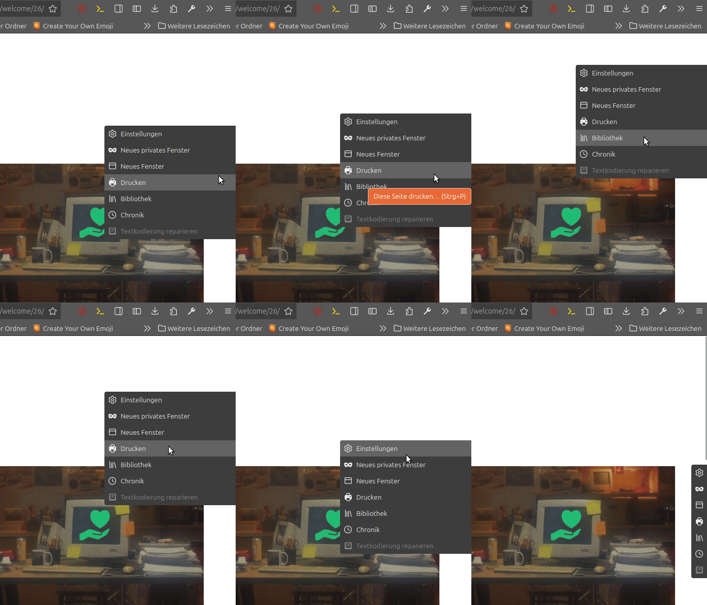
Update am 2025-12-05: Neue Version (Die vertikale Position der Leiste kann jetzt gescrollt werden).
Update von 00_FlyVertToolbarWithButton_lite.uc.js vom 2025-12-05 gibt es jetzt (und für zukünftige Versionen nur noch) in Beitrag #1 in diesem Thema:
Schaltbare vertikale Overlay-Zusatzleiste !

Also Schwamm drüber, ja?
Ja gerne, entschuldige bitte meine Aussage:
Das ist doch wiedermal Schrott; niemand braucht das!
Ich war einfach nur genervt von äußeren Umständen; Sorry! Das ist bestimmt kein Grund so überzureagieren.
Danke! Habe ich geändert!
Du bist Dir sicher, dass Deine Leiste "gebraucht" wird?
Siehe


...Downloads
Ich meinte: Wenn du einen Eintrag im Kontextmenü beeinflussen möchtest solltest du ihn ersteinmal selber erstellen, nur dann kanst du diesen auch buttonbezogen abrufen. (das kann funktionieren, muss aber nicht => Theorie)
Ich habe bis jetzt! auch keine Lsg. gefunden. Viel Glück...
Funzt merkwürdigerweise auch nicht:
//contextmenu
const xyz = document.getElementById("test_button_id");
xyz.addEventListener('contextmenu', () => {
     if (event.button === 2) {
      blabla();
  }
});
function blabla () {
const abc = document.getElementById("toolbar-context-menu");
const def = abc.querySelector(".customize-context-removeFromToolbar");
    def.style.outline = "2px solid orange";
}Kann ja auch nicht, denn in der Funktion 'blabla' fehlt ja irgendwie auch der Bezug zur ID des Buttons...
Dein JS Code ist etwas zu fortgeschritten für mein Vermögen; was reduziert bei dir den Rechtsklick auf den Button - preventDefault ?
@Horstmann Du fragst eine bestehende Klasse, die für alle Kontextmenüs gilt ab und veränderst diese. Ich denke, dass eine zusätzliche Klasse mit der ID des Kontextmenüs zuerst generiert werden müsste (.classList.add); um sie dann per querySelector beeinflussen zu können. Schematisches Beispiel:
//contextmenu
const abc = document.getElementById("Kontextmenü").classList.add('NeueKlasse');
document.getElementById("test_button_id").addEventListener('contextmenu', e => {
     if (event.button === 2) {
    let contexter = abc.querySelector("NeueKlasse");
    contexter.style.outline = "2px solid orange";
  }
});
Dann wandert er in das Überhangmenü.
Ist bei LINUX nicht so und der Button wird lediglich verkleinert und wandert eben nicht in das Überhangmenü; deshalb die Frage ob das auf dem MAC ebenso ist.
Zur Sicherheit sollte man also das: button.style.minWidth = 'fit-content'; lieber nicht löschen!
Bitte eine Erklärung, wenn ich die Link-Adresse(siehe Bild oben) zu meinem Installationsordner eingebe, so erscheint dieses Fenster, und nicht der Win-Explorer.
Kannn ich nicht beantworten, da LINUX.
DANKE fürs testen!
Prima Vorlage!
So war das gedacht! Feel free to change anything! Hier wäre ich allerdings vorsichtig:
//minWidth: 'fit-content',
Was passiert mit dem Button beim Verkleinern des Fensters?
Vorschläge willkommen
Ich nutze meist dies:
CustomizableUI Module — Firefox Source Docs documentation
oder auch das (leider keine Quelle):
Create a widget

To create a widget, you should pass an object with its desired
properties. The following properties are supported:

- id:    the ID of the widget (required).

- type:  a string indicating the type of widget. Possible types are:

'button' - for simple button widgets (the default)

'view'   - for buttons that open a panel or subview,
           depending on where they are placed.

'button-and-view' - A combination of 'button' and 'view',
           which looks different depending on whether it's
           located in the toolbar or in the panel: When
           located in the toolbar, the widget is shown as
           a combined item of a button and a dropmarker
           button. The button triggers the command and the
           dropmarker button opens the view. When located
           in the panel, shown as one item which opens the
           view, and the button command cannot be
           triggered separately.

'custom' - for fine-grained control over the creation
           of the widget.

- viewId:        Only useful for views and button-and-view widgets (and required there): the id of the <panelview> that should be
shown when clicking the widget.  If used with a custom
widget, the widget must also provide a toolbaritem where
the first child is the view button.

- onBuild(aDoc): Only useful for custom widgets (and required there); a function that will be invoked with the document in which
to build a widget. Should return the DOM node that has
been constructed.

- onBeforeCreated(aDoc): Attached to all non-custom widgets; a function that will be invoked before the widget gets a DOM node
constructed, passing the document in which that will happen.
This is useful especially for 'view' type widgets that need
to construct their views on the fly (e.g. from bootstrapped
add-ons). If the function returns `false`, the widget will
not be created.

- onCreated(aNode): Attached to all widgets; a function that will be invoked whenever the widget has a DOM node constructed, passing the
constructed node as an argument.

- onDestroyed(aDoc): Attached to all non-custom widgets; a function that will be invoked after the widget has a DOM node destroyed,
passing the document from which it was removed. This is
useful especially for 'view' type widgets that need to
cleanup after views that were constructed on the fly.

- onBeforeCommand(aEvt, aNode): A function that will be invoked when the user activates the button but before the command
        is evaluated. Useful if code needs to run to
        change the button's icon in preparation to the
        pending command action. Called for any type that
        supports the handler.  The command type, either
        "view" or "command", may be returned to force the
        action that will occur.  View will open the panel
        and command will result in calling onCommand.
+++++++++++++++++++++++++++++++++++++++++++++++++++++++++++++
- onCommand(aEvt): Useful for custom, button and button-and-view widgets; a
  function that will be invoked when the user activates
  the button. A custom widget with a view should
  return "view" or "command" to continue processing
  the command per the needs of the widget.

- onClick(aEvt): Attached to all widgets; a function that will be invoked
when the user clicks the widget.

- onViewShowing(aEvt): Only useful for views and button-and-view widgets; a
function that will be invoked when a user shows your view.
If any event handler calls aEvt.preventDefault(), the view
will not be shown.
----------------------------------------
The event's `detail` property is an object with an
`addBlocker` method. Handlers which need to
perform asynchronous operations before the view is
shown may pass this method a Promise, which will
prevent the view from showing until it resolves.
Additionally, if the promise resolves to the exact
value `false`, the view will not be shown.

- onViewHiding(aEvt): Only useful for views; a function that will be
invoked when a user hides your view.
++++++++++++++++++++++++++++++++++++++++++++++++++++++++++++
- l10nId:        fluent string identifier to use for localizing attributes on the widget. If present, preferred over the label/tooltiptext.

- tooltiptext:   string to use for the tooltip of the widget

- label:         string to use for the label of the widget

- localized:     If true, or undefined, attempt to retrieve the
widget's string properties from the customizable
widgets string bundle.

- removable:     whether the widget is removable (optional, default: true)
NB: if you specify false here, you must provide a defaultArea, too.

- overflows:     whether widget can overflow when in an overflowable
toolbar (optional, default: true)

- defaultArea:   default area to add the widget to
(optional, default: none; required if non-removable)

- shortcutId:    id of an element that has a shortcut for this widget
(optional, default: null). This is only used to display
the shortcut as part of the tooltip for builtin widgets
(which have strings inside
customizableWidgets.properties). If you're in an add-on,
you should not set this property.
If l10nId is provided, the resulting shortcut is passed
as the "$shortcut" variable to the fluent message.

- showInPrivateBrowsing: whether to show the widget in private browsing mode (optional, default: true)

- hideInNonPrivateBrowsing: whether to hide the widget in non private browsing mode windows (optional, default: false)

- tabSpecific: If true, closes the panel if the tab changes.

- locationSpecific: If true, closes the panel if the location changes.
This is similar to tabSpecific, but also if the location changes in the same tab, we may want to close the panel.

- webExtension: Set to true if this widget is being created on behalf of an extension.
--------------------------------------------------

@param aProperties the specifications for the widget.

@return a wrapper around the created widget (see getWidget)Ein Beispiel eines einfachen widgets vom typ button wäre (besteht auch den Elchtest) :
// JavaScript Document
// B_LinkFedia.uc.js

// Das Script erstellt einen Button, der einen Link auf eine Website (fedia.io/m/FirefoxCSS) ausführt. So kann auch bei ausgeblendeter Lesezeichenleiste auf die Seite schnell zugegriffen werden.


(function() {
  if (!window.gBrowser)
	return;
const
// ■■ START UserConfiguration ■■■■■■■■■■■■■■■■■■■■■■■■■■■■■■■■
         id = 'link-button-fedia', // Id des Buttons
       link = 'fedia.io/m/FirefoxCSS', // Linkziel des Buttons
      label = 'Quicklink: Fedia', // Bezeichnung des Buttons
tooltiptext = 'Quicklink:\nfedia.io/m/FirefoxCSS',
// Icon-------------------------------------------------------
       icon = '16-Fedia_Logo.svg',  // [Name.Dateiendung] des Symbols
   iconPath = '/chrome/icons/', // Pfad zum Ordner der das Icon beinhaltet
// ■■ END UserConfiguration ■■■■■■■■■■■■■■■■■■■■■■■■■■■■■■■■■■
 curProfDir = PathUtils.toFileURI(PathUtils.join(PathUtils.profileDir));

	if (Services.prefs.getBoolPref('svg.context-properties.content.enabled') == false) {
		Services.prefs.setBoolPref('svg.context-properties.content.enabled', true );
	}
//BUTTON
	try {
CustomizableUI.createWidget({
    id: id,
    defaultArea: CustomizableUI.AREA_NAVBAR,
    label: label,
    tooltiptext: tooltiptext,

    onCreated: (button) => {
		button.style.MozContextProperties = 'fill, stroke, fill-opacity';
		button.style.listStyleImage = 'url("' + curProfDir + iconPath + icon + '")';
		button.style.minWidth = 'fit-content';
	}
});
	} catch(e) {};

const button = document.getElementById(id);
//click
button.addEventListener('click', () => {
	if (event.button === 0) {
       	 event.target.ownerGlobal.openTrustedLinkIn(link, "tab");
	}
});

})();wenn ich die Leiste komplett "aus" habe,
den FF neu starte ist eine Leise, ohne Funktion zu sehen
Kann ein Linuxuser nicht bestätigen.
vielleicht testen noch ein paar andere User
Ich habe das Script aus #116 in einem neuen Profil auf Linux getestet. Läuft ohne Probleme! Auch mit sämtlichen firefoxeigenen Sitebars.
Die Bedienung ist für mich etwas 'gewöhnungsbedürftig' aber das ist ja wohl so gewollt.
Ich bin gerade über diesen Artikel in der 'taz' gestolpert:

aber das sind nicht die einzelnen Button
Irrtum meinerseits, ich dachte der Rahmen wäre nur um die einzelnen Buttons. Das war auf dem Screen leider nicht ersichtlich.
