1. Nachrichten
  2. Forum
    1. Unerledigte Themen
    2. Forenregeln
  3. Spenden
  • Anmelden
  • Registrieren
  • Suche
Alles
  • Alles
  • Artikel
  • Seiten
  • Forum
  • Erweiterte Suche
  1. camp-firefox.de
  2. flax

Beiträge von flax

  • FF89 - Mehrreihige Tableiste / Tab Schließen Button / aktive Tab Farbe

    • flax
    • 9. Juni 2021 um 16:19

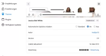
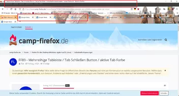
    Stimmt es liegt zum Teil am Theme. Nutze das hier..

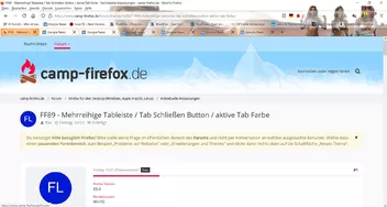
    .. aber mit Standard Theme paßt es auch noch nicht ganz, der Rand um die Tabs ist nicht schlüssig.

    Obwohl ich natürlich schon mein altes Theme gerne weiterverwenden würde...

    Also ich muss echt sagen mit welcher Leidenschaft IHR Helfer in der Freizeit den Problemen der Nichtswissenden nachgeht und uns helft ... Respekt !!!

  • FF89 - Mehrreihige Tableiste / Tab Schließen Button / aktive Tab Farbe

    • flax
    • 9. Juni 2021 um 15:24

    Hallo Andreas, vielen Dank aber jetzt verändert sich ein bissi was...

    vorher:

    nachher:

  • FF89 - Mehrreihige Tableiste / Tab Schließen Button / aktive Tab Farbe

    • flax
    • 9. Juni 2021 um 13:34

    So, vielen Dank erstmal an alle die mir geholfen haben.

    Soweit bin ich mit meinem neuen Fuchs hinsichtlich der individuellen Anpassungen zufrieden.

    Das einzigste was noch aussteht ist eine 3-Zeilige Tab-Leiste mit Scrollbalken.

    Habe noch viel probiert bzw. aus anderen Beiträgen versucht zu übernehmen jedoch ohen Erfolg.

    Vielleicht hat ja noch jemand die Lösung parat.

    Mein aktueller Code anbei.

    Liebe Grüße und vielen Dank!

    CSS
    /*Abstände der Einträge im Kontext wieder schmaler*/
    menupopup > menuitem,
    menupopup > menu {
      padding-block: 0 !important;
      padding-inline-start: 14px !important;
    }
    
    
    #TabsToolbar {
        position: absolute !important;
        display:block !important;
        top: 85px !important;
        width: 100vw !important;
    }
    #tabbrowser-tabs {
        width: 100vw !important;
    }
    #main-window:not([chromehidden*="toolbar"]) #navigator-toolbox {
        padding-bottom: var(--tab-min-height) !important;
    }
    :root {
        --tab-min-height: 33px !important;
    }
    :root #tabbrowser-tabs {
        --tab-min-height: 30px !important;
    }
        .tabbrowser-tab:not([pinned]) {
        -moz-box-flex: 0!important;
        width: 157px!important;
    
    }
    
    
    /* -------------------------------------------------*/
    /************* aktiven Tab einfärben ****************/
    /* -------------------------------------------------*/
    
    .tab-background[selected="true"]{
        background-color:transparent !important;
        box-shadow: inset 0px 0px 40px 0px #ff8000 !important;
    }
    
    
    /* -------------------------------------------------*/
    /************* inaktiven Tab einfärben ****************/
    /* -------------------------------------------------*/
    
    .tab-background:not([selected]):not([multiselected]) {
        background-color:transparent !important;
        box-shadow: inset 0px 0px 5px 0px #ff8000 !important;
    }


        /* Tab-Schließen-Button:
        * Rechts weniger Abstand zum TAB-Rand, etwas größer,
        * Textfarbe (Kreuz)
        * Hintergrundfarbe, an den Eckenradius des Buttons angepaßt.*/
     
        #TabsToolbar .tab-close-button {
        margin-right: 1px !important;
        padding: 0 !important;
        color: black !important; }
    
        #TabsToolbar .tab-close-button .toolbarbutton-icon {
        height: 18px !important;
        width:  18px !important;
        background-color: red !important;
        border-radius: 5px !important; }


    /*Lesezeichen Sternchen Button*/
      
    #star-button[starred="true"] {
        fill: #DF0101 !important;
        }
    
    
    /*Download Button*/
    
    #downloads-button[indicator="true"]:not([attention="success"]) #downloads-indicator-icon {
        fill: #000000 !important;
        }
    #downloads-button[progress="true"] #downloads-indicator-anchor #downloads-indicator-icon {
        fill: #B40431 !important;
        }
    #downloads-button {
        --toolbarbutton-icon-fill-attention: #B40431 !important;
        }
    #downloads-button > .toolbarbutton-badge-stack > #downloads-indicator-progress-outer { 
        border-color: #B40431 !important;
        }
    #downloads-indicator-start-image {
        fill: #B40431 !important;
        }
    Alles anzeigen
  • FF89 - Mehrreihige Tableiste / Tab Schließen Button / aktive Tab Farbe

    • flax
    • 4. Juni 2021 um 15:00
    Zitat von Mira_Belle

    Mit diesem Schnipsel Code wäre der aktive Tab zumindest halbtransparent eingefärbt.

    CSS
    /* -------------------------------------------------*/
    /************* aktiven Tab einfärben ****************/
    /* -------------------------------------------------*/
    
    .tab-background[selected="true"]{
        background-color:transparent !important;
        box-shadow: inset 0px 0px 40px 0px #ff8000 !important;
    }

    In diesem Fall Orange, aber das kann man ja ändern.

    Super vielen Dank, das finde ich schonmal gar nicht sooo schlecht :)

    Nur noch zwei Baustellen ;)

  • FF89 - Mehrreihige Tableiste / Tab Schließen Button / aktive Tab Farbe

    • flax
    • 4. Juni 2021 um 10:21

    Hallo,

    habe meinen letzten Thread geschlossen, da ich teilweise schon Lösungen gefunden habe.

    Mein aktueller Code wäre

    CSS
    /*Abstände der Einträge im Kontext wieder schmaler*/
    menupopup > menuitem,
    menupopup > menu {
      padding-block: 0 !important;
      padding-inline-start: 14px !important;
    }
    
    
    #TabsToolbar {
        position: absolute !important;
        display:block !important;
        top: 85px !important;
        width: 100vw !important;
    }
    #tabbrowser-tabs {
        width: 100vw !important;
    }
    #main-window:not([chromehidden*="toolbar"]) #navigator-toolbox {
        padding-bottom: var(--tab-min-height) !important;
    }
    :root {
        --tab-min-height: 33px !important;
    }
    :root #tabbrowser-tabs {
        --tab-min-height: 30px !important;
    }
        .tabbrowser-tab:not([pinned]) {
        -moz-box-flex: 0!important;
        width: 157px!important;
    }
    Alles anzeigen

    in der Vorschau sieht das nun so aus

    Nun hätte ich gerne wieder eine 3 Zeilige Tableiste mit Scrollbalken.

    Der alte Code hierzu war

    CSS
    /* Tableiste mehrreihig */
    @-moz-document url(chrome://browser/content/browser.xhtml) {
    
    [tabsintitlebar="true"][sizemode="maximized"] #navigator-toolbox {
    padding-top: 8px !important;
    }
    
    #titlebar,#tabbrowser-tabs {
    appearance: none !important;
    }
    
    [tabsintitlebar="true"] #TabsToolbar > .titlebar-buttonbox-container,
    #main-window[inFullscreen="true"] #window-controls {
    display: block;
    }
    
    /* Mehrreihige Tableiste, Anzahl der angezeigten Tabreihen = 3 Zeilen, weitere per Scrollbar */
    box[class="scrollbox-clip"][orient="horizontal"],
    tabs > arrowscrollbox { display: block; }
    scrollbox[part][orient="horizontal"] {
    display: flex;
    flex-wrap: wrap;
    max-height: calc(var(--tab-min-height) * 3); /* Anzahl der angezeigten Tabreihen = 3 Zeilen */
    overflow-x: hidden;
    overflow-y: auto;
    }
    
    tabs tab[fadein]:not([pinned]) {
    flex-grow: 1;
    }
    
    tabs tab,.tab-background {
    height: var(--tab-min-height);
    overflow: hidden;
    }
    
    tab > .tab-stack {
    width: 100%;
    }
    
    box[class="scrollbox-clip"][orient="horizontal"] {
    -moz-window-dragging: no-drag;
    }
    
    hbox.titlebar-spacer,
    #alltabs-button,tabs tab:not([fadein]) {
    display: none;
    }
    Alles anzeigen

    den Schließen-Button im Tab (Kreuz) hätte ich auch gerne wieder ein bissi größer

    der alte Code hierzu war

    CSS
    /************* Tabschliessen-Button ****************/
    .tab-close-button.close-icon{
        display: -moz-box !important;
        width: 20px; height: 20px !important;
        border: none !important;
        background-color: none !important;
    }
    
    .tab-close-button {
        color: black !important; /* Farbe des Kreuzes */
    }      
    Alles anzeigen

    zum Schluß hätte ich gerne den aktiven Tab gerne etwas eingefärbt

    mein alter Code hierzu war

    CSS
    /*------------------*/
    /* Tab-Hintergrund  */
    /*------------------*/
    
    /*--- selektiert ---*/
    .tab-background[selected=true]:not(:-moz-lwtheme) > spacer {
        background-image:  linear-gradient( rgba(255,255,170,1), rgba(255,58,95,1) ), none !important; /* blau */
        /*background-image:  linear-gradient( rgba(255,255,170,1), rgba(84,25,25,1) ),  none !important;*/  /* rot */
        filter: drop-shadow(4px 3px 2px rgba(0,0,0,0.33)) drop-shadow(-4px 3px 2px rgba(0,0,0,0.33)) !important; 
    }
    .tab-background[selected=true]:-moz-lwtheme > spacer {
        background-image:  linear-gradient( rgba(255,255,170,1), rgba(255,58,95,1) ), none !important;
        filter: drop-shadow(3px 3px 2px rgba(0,0,0,0.33)) drop-shadow(-2px 3px 2px rgba(0,0,0,0.33)) !important; 
    }
    
    /*--- hover(nicht selektiert) ---*/
    .tabbrowser-tab:hover > .tab-stack > .tab-background:not([selected=true]):not(:-moz-lwtheme) > spacer {
        background-image:  linear-gradient( rgba(255,255,255,1), rgba(115,115,115,1) ),  none !important; 
        filter: brightness(130%) contrast(95%) drop-shadow(1px 1px 1px rgba(0,0,0,0.33)) drop-shadow(-1px 1px 1px rgba(0,0,0,0.33)) !important; 
    }
    .tabbrowser-tab:hover > .tab-stack > .tab-background:not([selected=true]):-moz-lwtheme > spacer {
        background-image:  linear-gradient( rgba(225,255,225,0.66), rgba(100,125,145,0.66) ),  none !important; 
        box-shadow: 1px 1px 1px rgba(0, 0, 0, 0.75);
    }
    
    /*--- nicht selektiert ---*/
    .tab-background:not([selected=true]):not(:-moz-lwtheme) > spacer {
        background-image:  linear-gradient( rgba(255,255,255,1), rgba(125,125,125,1) ),  none !important; 
        filter: brightness(115%) contrast(90%) drop-shadow(1px 1px 1px rgba(0,0,0,0.33)) drop-shadow(-1px 1px 1px rgba(0,0,0,0.33)) !important; 
    }
    .tab-background:not([selected=true]):-moz-lwtheme > spacer {
        background-image:  linear-gradient( rgba(255,255,255,0.33), rgba(110,110,110,0.33) ),  none !important; 
        box-shadow: 1px 1px 1px rgba(0, 0, 0, 0.75);
    }
    
    /*--- Multi-selektiert ---*/
    .tab-background[multiselected=true]:not([selected=true]) > spacer {
        background-image:  linear-gradient( rgba(225,225,225,1), rgba(50,98,135,1) ), none !important;
    }
    .tabbrowser-tab:hover > .tab-stack > .tab-background[multiselected=true]:not([selected=true]) > spacer {
        background-image:  linear-gradient( rgba(225,225,225,1), rgba(50,98,135,1) ), none !important; 
    }    
    Alles anzeigen

    bisher sah das dann so aus

    Habe selber schon viel probiert, bin aber leider mit meinem Latein am Ende.

    Vielleicht hat ja jemand eine Lösung für mich.

    Wäre sehr dankbar!

    LG flax

  • Tab-Leiste anpassen

    • flax
    • 2. Juni 2021 um 16:14
    Zitat von 2002Andreas
    Zitat von flax

    folgenden Eintrag von true auf false änder

    Damit schaltest du das neue Design vom Firefox aus.

    Der Eintrag wird aber demnächst wieder entfernt.

    Von daher solltest du lieber nach Lösungen für deine Probleme suchen. ;)

    ok gut zu wissen..

    Ja deswegen frage ich ja ob jemand ne Lösung hat bzw. was ich im Code ändern muss??

    Habe schon bissi was probiert aber bisher ohne Erfolg, bin da auch nicht so erfahren..

    Liebe Grüße

  • Tab-Leiste anpassen

    • flax
    • 2. Juni 2021 um 14:30
    Zitat von Mira_Belle

    Hi flax

    In Zeile 59

    CSS
    max-height: calc(var(--tab-min-height) * 3); /* Anzahl der angezeigten Tabreihen = 3 Zeilen */

    mal in

    CSS
    max-height: calc(var(--tab-min-height) * 1); /* Anzahl der angezeigten Tabreihen = 3 Zeilen */

    ändern?

    Versuch macht kluch.

    Gruß

    Mira

    Alles anzeigen

    Leider ohne Erfolg bzw. ohne Veränderung.

    Wenn ich jedoch unter about:config folgenden Eintrag von true auf false änder schaut es wieder so aus.

    browser.proton.enabledfalse

    Ist das dann die richtige Lösung?

  • Tab-Leiste anpassen

    • flax
    • 2. Juni 2021 um 09:16

    Hallo,

    wäre jemand so nett und könnte sich mal mein userChrome.css ansehen und anpassen?

    Seit dem Update sind folgende Probleme aufgetreten:

    In der Memüleiste ist die Schrift etwas verschwommen. Beim Verändern des Themes in Hell oder Dunkel passt sich die Schrift automatisch an, wenn ich aber ein alternatives Theme verwende ist die Schrift schlecht lesbar.

    Die Tab-Leiste macht jetzt nach oben (zur Lesezeichen-Symbolleiste) und unten (zur eigentlichen Webseite) einen deutlichen Leerraum.

    Desweiteren würde ich gerne den aktiven Tab noch farblich hervorheben.

    Habe schon vieles probiert aber leider nicht lösen können.

    Vielen Dank schonmal im Voraus.

    CSS
    @charset "UTF-8";
    
    
    /* Tab-Leiste unterhalb der Symbolleiste verschieben */
    #titlebar { -moz-box-ordinal-group: 2; }
    
    
    /* Menü nach oben verschieben */
    #toolbar-menubar { position: fixed; display: inline-flex; }
    [sizemode="maximized"]:not([tabsintitlebar="true"]) #toolbar-menubar,
    [sizemode="normal"] #toolbar-menubar { top: 1px; }
    [sizemode="maximized"] #toolbar-menubar { top: 8px; }
    
    
    /* Platz für die Menüleiste oberhalb der Symbolleiste schaffen */
    #main-window[tabsintitlebar="true"] #navigator-toolbox:not([inFullscreen="true"]) { border-top: solid 29px transparent !important; }
    #main-window:not([tabsintitlebar="true"]) #navigator-toolbox:not([inFullscreen="true"]) { border-top: solid 21px transparent !important; }
    
    
    /* Freien Bereich für Menü und Titelleistenschaltflächen festlegen */
    [tabsintitlebar="true"] #navigator-toolbox { -moz-window-dragging: drag; }
    
    
    /* Titelleistenschaltfläche nach rechts oben verschieben */
    #navigator-toolbox:not([style^="margin-top:"])[style=""][inFullscreen="true"] #window-controls,
    [tabsintitlebar="true"] .titlebar-buttonbox-container { display: block; position: fixed; right: 0; }
    [tabsintitlebar="true"][sizemode="normal"] .titlebar-buttonbox-container { top: 1px; }
    [tabsintitlebar="true"][sizemode="maximized"] .titlebar-buttonbox-container { top: 8px; }
    #navigator-toolbox:not([style^="margin-top:"])[style=""][inFullscreen="true"] #window-controls { top: 0; }
    
    
    /* auf der rechten Seite Platz machen, damit die Schaltflächen der Titelleiste und der
    Navigationssymbolleiste nicht im Vollbildmodus angezeigt werden */
    #navigator-toolbox[inFullscreen="true"] #nav-bar { padding-right: 109px !important; }
    
    
    /* Tableiste mehrreihig */
    @-moz-document url(chrome://browser/content/browser.xhtml) {
    
    [tabsintitlebar="true"][sizemode="maximized"] #navigator-toolbox {
    padding-top: 8px !important;
    }
    
    #titlebar,#tabbrowser-tabs {
    appearance: none !important;
    }
    
    [tabsintitlebar="true"] #TabsToolbar > .titlebar-buttonbox-container,
    #main-window[inFullscreen="true"] #window-controls {
    display: block;
    }
    
    /* Mehrreihige Tableiste, Anzahl der angezeigten Tabreihen = 3 Zeilen, weitere per Scrollbar */
    box[class="scrollbox-clip"][orient="horizontal"],
    tabs > arrowscrollbox { display: block; }
    scrollbox[part][orient="horizontal"] {
    display: flex;
    flex-wrap: wrap;
    max-height: calc(var(--tab-min-height) * 3); /* Anzahl der angezeigten Tabreihen = 3 Zeilen */
    overflow-x: hidden;
    overflow-y: auto;
    }
    
    tabs tab[fadein]:not([pinned]) {
    flex-grow: 1;
    }
    
    tabs tab,.tab-background {
    height: var(--tab-min-height);
    overflow: hidden;
    }
    
    tab > .tab-stack {
    width: 100%;
    }
    
    box[class="scrollbox-clip"][orient="horizontal"] {
    -moz-window-dragging: no-drag;
    }
    
    hbox.titlebar-spacer,
    #alltabs-button,tabs tab:not([fadein]) {
    display: none;
    }
    
    /* Feste Breite der einzelnen Tabs wenn gewünscht, sonst entfernen bzw. verbreitern */
    tabs tab[fadein]:not([pinned]) {
    min-width: 150px !important;/* Minimale Tabbreite 76px */
    max-width: 150px !important;/* Maximale Tabbreite 225px */
    }
    }
    
    /* Buttons/Zwischenräume Ausblenden */
    hbox.titlebar-spacer,
    #alltabs-button,tabs tab:not([fadein]), 
    [class="scrollbutton-up"],
    [class="scrollbutton-up"] + spacer,
    scrollbox[part][orient="horizontal"] + spacer,
    [class="scrollbutton-down"] { 
        display: none; 
    }
    tabs tab {
        border-left: solid 1px hsla(0,0%,50%,.5);
        border-right: solid 1px hsla(0,0%,50%,.5);
    }
    tabs tab:after,tabs tab:before { display: none;}
    
    #TabsToolbar:not(:-moz-lwtheme){ 
        color: black !important;
    }
    #TabsToolbar > .titlebar-buttonbox-container {
        display: none !important;
    }    
    
    /* -----------------------------*/
    /* Tab: Optische Anpassungen    */
    /* -----------------------------*/
    
    #tabbrowser-tabs :not([fokus]){
        opacity: 1!important;
    }
    
    /* Schriftart/Schriftgröße ändern */
    .tabbrowser-tab .tab-label {
        text-shadow: none !important;    
        font-weight: 500 !important;
        font-size:   12px !important;
        font-family: "Arial" !important;
        color: black !important;
    }
    .tabbrowser-tab .tab-label:not(:-moz-lwtheme) {
        text-shadow: none !important; 
        color: black !important; 
    }
    .tabbrowser-tab .tab-label[selected="true"] {
        text-shadow: none !important;
        color: black !important; 
        font-weight: 500 !important;
        font-size:   12px !important; 
        font-family: "Arial" !important; 
    }
    
    
    /* Tab-Höhe  */
    .tabbrowser-tab {
        min-height: 30px !important;
        max-height: 30px !important;
        vertical-align: bottom !important;
        margin-top: 1px !important;
        margin-bottom: 1px !important;
    }
    
    /* Tab-Rahmen entfernen */
    #TabsToolbar .tabbrowser-tab[visuallyselected="true"],
    #TabsToolbar .tabbrowser-tab,
    #TabsToolbar .tabbrowser-tab .tab-background {
        background: unset !important;
        border-top: unset !important;
        outline: none !important;
    }
    
    /* Tab-Schließen-Button entfernen *//*
    .tabbrowser-tab .tab-close-button {
      visibility: collapse !important;
    }
    */
    
    /************* Tabschliessen-Button ****************/
    .tab-close-button.close-icon{
        display: -moz-box !important;
        width: 20px; height: 20px !important;
        border: none !important;
        background-color: none !important;
    }
    
    .tab-close-button {
        color: black !important; /* Farbe des Kreuzes */
    }      
    
    /* Tab-Icon ausrichten *//*
    .tab-throbber:not([pinned]),
    .tab-sharing-icon-overlay:not([pinned]),
    .tab-icon-pending:not([pinned]),
    .tab-icon-image:not([pinned]) 
    {
      margin-top: -1px !important;
    }
    */
    /*------------------*/
    /* Tab-Hintergrund  */
    /*------------------*/
    
    /*--- selektiert ---*/
    .tab-background[selected=true]:not(:-moz-lwtheme) > spacer {
        background-image:  linear-gradient( rgba(255,255,170,1), rgba(255,58,95,1) ), none !important; /* blau */
        /*background-image:  linear-gradient( rgba(255,255,170,1), rgba(84,25,25,1) ),  none !important;*/  /* rot */
        filter: drop-shadow(4px 3px 2px rgba(0,0,0,0.33)) drop-shadow(-4px 3px 2px rgba(0,0,0,0.33)) !important; 
    }
    .tab-background[selected=true]:-moz-lwtheme > spacer {
        background-image:  linear-gradient( rgba(255,255,170,1), rgba(255,58,95,1) ), none !important;
        filter: drop-shadow(3px 3px 2px rgba(0,0,0,0.33)) drop-shadow(-2px 3px 2px rgba(0,0,0,0.33)) !important; 
    }
    
    /*--- hover(nicht selektiert) ---*/
    .tabbrowser-tab:hover > .tab-stack > .tab-background:not([selected=true]):not(:-moz-lwtheme) > spacer {
        background-image:  linear-gradient( rgba(255,255,255,1), rgba(115,115,115,1) ),  none !important; 
        filter: brightness(130%) contrast(95%) drop-shadow(1px 1px 1px rgba(0,0,0,0.33)) drop-shadow(-1px 1px 1px rgba(0,0,0,0.33)) !important; 
    }
    .tabbrowser-tab:hover > .tab-stack > .tab-background:not([selected=true]):-moz-lwtheme > spacer {
        background-image:  linear-gradient( rgba(225,255,225,0.66), rgba(100,125,145,0.66) ),  none !important; 
        box-shadow: 1px 1px 1px rgba(0, 0, 0, 0.75);
    }
    
    /*--- nicht selektiert ---*/
    .tab-background:not([selected=true]):not(:-moz-lwtheme) > spacer {
        background-image:  linear-gradient( rgba(255,255,255,1), rgba(125,125,125,1) ),  none !important; 
        filter: brightness(115%) contrast(90%) drop-shadow(1px 1px 1px rgba(0,0,0,0.33)) drop-shadow(-1px 1px 1px rgba(0,0,0,0.33)) !important; 
    }
    .tab-background:not([selected=true]):-moz-lwtheme > spacer {
        background-image:  linear-gradient( rgba(255,255,255,0.33), rgba(110,110,110,0.33) ),  none !important; 
        box-shadow: 1px 1px 1px rgba(0, 0, 0, 0.75);
    }
    
    /*--- Multi-selektiert ---*/
    .tab-background[multiselected=true]:not([selected=true]) > spacer {
        background-image:  linear-gradient( rgba(225,225,225,1), rgba(50,98,135,1) ), none !important;
    }
    .tabbrowser-tab:hover > .tab-stack > .tab-background[multiselected=true]:not([selected=true]) > spacer {
        background-image:  linear-gradient( rgba(225,225,225,1), rgba(50,98,135,1) ), none !important; 
    }    
    
    /* Tableiste Linken und rechten Ziehbereich Ausblenden
    Links und rechts ? hbox.titlebar-spacer
    Nur links ? hbox.titlebar-spacer[type="pre-tabs"]
    Nur rechts ? hbox.titlebar-spacer[type="post-tabs"] */
    hbox.titlebar-spacer
    ,
    /* Ausblenden */
    #alltabs-button,tabs tab:not([fadein]),
    [class="scrollbutton-up"],[class="scrollbutton-up"] ~ spacer,
    [class="scrollbutton-down"] { display: none; }
    
    /*Abstände der Einträge im Kontext wieder schmaler*/
    menupopup > menuitem,
    menupopup > menu {
      padding-block: 0 !important;
      padding-inline-start: 14px !important;
    }
    
    /* Lesezeichen Sidebar - Ordnericon stehend black */
    @-moz-document url("chrome://browser/content/browser.xhtml"),
                   url("chrome://browser/content/places/bookmarksSidebar.xhtml") {
        treechildren::-moz-tree-image(container) {
    fill:black !important;}
    }
    
    /* Lesezeichen verwalten - Ordnericon stehend black */
    @-moz-document url-prefix("chrome://browser/content/places/places.xhtml") {
        treechildren::-moz-tree-image(container) {
    fill:black !important;}
    }
    
    /* Lesezeichen - Ordnericon black */
    @-moz-document url-prefix("chrome://browser/content/browser.xhtml") {
        .bookmark-item[container="true"] {
    fill:black !important;}
    }
    Alles anzeigen

Unterstütze uns!

Jährlich (2025)

59,1 %

59,1% (384,24 von 650 EUR)

Jetzt spenden
  1. Kontakt
  2. Datenschutz
  3. Impressum
Community-Software: WoltLab Suite™
Mastodon