1. Nachrichten
  2. Forum
    1. Unerledigte Themen
    2. Forenregeln
  3. Spenden
  • Anmelden
  • Registrieren
  • Suche
Alles
  • Alles
  • Artikel
  • Seiten
  • Forum
  • Erweiterte Suche
  1. camp-firefox.de
  2. Mira_Belle

Beiträge von Mira_Belle

  • Tabform

    • Mira_Belle
    • 3. November 2023 um 22:39

    Hey @Horstmann ,

    bist Du denn kirre?

    Weißt Du wie lange ich an Deinem Code gesessen habe, um auch nur zu erahnen, wie das alles funktioniert?

    Irgendwie habe ich es geschafft, ihn meinen Vorstellungen anzupassen

    und jetzt kommst Du mit einer noch geileren Version :!: :D

    Woran ich aber verzweifele, einen Rand um den "Neuen Tabbutton" zu zaubern.

    Entweder spricht der Selektor ALLE Buttons an, also die selbsterstellten, oder

    der "Rahmen" steht viel zu weit um den Button und ist auch nicht rund.

    Nun werde ich mich nächste Woche dann mal mit Deinem neuen und besseren Code befassen.

    Und höre auf, diesen noch weiter zu optimieren, der ist gut.

    Apropos anpassen, so habe ich Deinen Code hingebogen.

    Ob ich das mit Deinem neuen Code auch so hinbekomme?

  • Tabform

    • Mira_Belle
    • 2. November 2023 um 21:49

    @Horstmann

    Du bist ein Schatz!

    Dein letzter Code funktioniert hervorragend und das auch im Kompaktmodus.

    Um die Tableiste nach unten zu versetzen, habe ich nachfolgenden Code noch eingesetzt.

    CSS
        /*-------------------------------------------*/
        /****     Tabbar nach unten verschoben    ****/
        /*-------------------------------------------*/
        
        #navigator-toolbox {
            position: relative !important;
            padding-bottom: calc( var(--tab-min-height) + 10px ) !important;
        }
    
        #TabsToolbar {
            position: absolute !important;
            display: block !important;
            bottom: 0 !important;
        }
    
        #tabbrowser-tabs {
            width: 95vw !important;
        }
    Alles anzeigen

    Nun kann ich daran machen diesen Code auseinander zu pflücken, damit ich dahinterkomme,

    wie das alles zusammen hängt und funktioniert.

    Danach werde ich mir die Farbeinstellungen vornehmen.

    Aber alles eins nach dem anderen.

    Vielen lieben Dank noch mal. :*

  • Tabform

    • Mira_Belle
    • 2. November 2023 um 17:12

    8| :/ ||

    Dein Code, OHNE Veränderung,

    OK, den Pfad angepasst!

    Deine Vektorgrafiken.

    Hier noch mal der Code, aus Beitrag #43, mit neuen Pfadangaben!

    CSS
    /*  ERSETZEN  */
    
    #titlebar {
        order: 1 !important;
    } 
    
    /*  ERSETZEN ENDE  */


    :root {
    
        /*--tab-min-height: 68px !important;*/
        /*--ug-height: calc(var(--tab-min-height) / 2);*/
    
    /* Ecken ohne svg radius */
        /*--ug-radius: 18px;*/
        --ug-radius: 20px;
    
    /* Rand Farben */
        --ug-color-border: hsla(0, 0%, 83%, 0.5);
        --ug-stroke: hsla(0, 0%, 83%, 0.35);
    
    
    /*  Farben tab hg / basic / selected / hover */
        --ug-color1: hsla(0, 0%, 83%, 0.25);
        --ug-color2:  hsla(35, 80%, 60%, 0.25);
        --ug-color_hova: hsla(0, 0%, 50%, 0.25);
    
    /* tab bar rand unten Farbe */
        --ug-color3: hsla(0, 0%, 83%, 0.75);
    }
    
    
     #TabsToolbar {
        -moz-context-properties: fill, stroke, stroke-opacity !important;
        background-image: linear-gradient(to top, 
            var(--ug-color3) 1px, transparent 1px) !important;
    
        /*outline: 1px solid grey !important;
        outline-offset: -1px !important;*/
        /*outline: 1px solid hsla(0, 0%, 100%, 0.75) !important;
        outline-offset: -13px !important;*/
    } 
    
    
    /* buttons adjust position */
    
    #TabsToolbar toolbarbutton {
        margin-top: -0px !important;
    }
    
    .tab-label, .tab-close-button {
        text-shadow: none  !important;
    }
    
    #tabbrowser-tabs {
        --ug_margin_plus: 1px -1px;
    }
    :is(#scrollbutton-up, #scrollbutton-down) {
        margin-block:  var(--ug_margin_plus) !important;
    }
    
    #tabbrowser-arrowscrollbox-periphery #tabs-newtab-button .toolbarbutton-icon {
        margin-left: 4px !important;
        border-radius: 50% !important;
    }
    
    .tab-content {
        margin-top: 3px !important;
    }
    
    .tabbrowser-tab:is([visuallyselected], [multiselected]) {
       z-index: 2 !important;
    }
    
    /* Annoying fix to prevent hovering of last tab to trigger tab overflow, better solution wanted */
    /* https://github.com/MrOtherGuy/firefox-csshacks/blob/master/chrome/curved_tabs.css  */
    
    .tabbrowser-tab:last-of-type {
        margin-inline-end: 11px !important;
    }
    
    
    /* tabs distance */
    
    .tabbrowser-tab:not([pinned]) {
        /*padding-inline: 16px !important;*/
        padding-inline: 2px !important;
        overflow: visible !important;
    }
    
    
                                                               /*** tabs base ***/
    /* tabs connected bottom */
    
    .tab-background {
        margin-block: 4px 0px !important;
    }
    
    .tabbrowser-tab .tab-background {
        background-color: var(--ug-color1) !important;
        box-shadow: none !important;
        /*border-image: linear-gradient(to top, 
                               var(--ug-color1), var(--ug-color1)) 1 / 0 0 1px 0  !important;*/
        border-image-outset: 0 1px !important;
        fill: var(--ug-color1, transparent) !important;
        /*stroke: var(--ug-stroke) !important;*/
        outline: none !important;
        /*min-height: calc(var(--tab-min-height) - 1px) !important;*/
        /*box-shadow:  inset 0px 1px var(--ug-color-border) !important;*/
    }
    
    
    /* tabs selected */
    
    .tabbrowser-tab:is([visuallyselected], [multiselected]) .tab-background {
        background-image: none !important;
        background-color: var(--ug-color2) !important;
        fill: var(--ug-color2, transparent) !important;
    }
    
    /* tabs unselected hover */
    
    .tabbrowser-tab:not([visuallyselected], [multiselected]):hover .tab-background {
        background-color: var(--ug-color_hova) !important;
        fill: var(--ug-color_hova) !important;
    }
    
                                                               /*** tabs Radien, borders ***/
    
    /*   basis   */
    .tabbrowser-tab .tab-background {
        border-radius: var(--ug-radius) var(--ug-radius) var(--ug-radius)  0 !important;
        border: 1px solid var(--ug-color-border) !important;
        border-bottom: none !important;
    }
    
    .tabbrowser-tab:not([pinned]) .tab-background {
        border-left: none !important;
    }
    
    /*   selected , pinned  */
    .tabbrowser-tab:is([visuallyselected], [pinned]) .tab-background {
        border-radius: var(--ug-radius) var(--ug-radius) 0 0 !important;
    }
    
    /*   selected  border   */
    .tabbrowser-tab[visuallyselected]:not([pinned]) .tab-background {
        border-inline: none !important;
        /*border: none !important;*/
    }
    
    /*   not selected -> nach selected  */
    
    .tabbrowser-tab:is([visuallyselected]):not([pinned]) + .tabbrowser-tab:not([visuallyselected]) .tab-background {
        border-radius: var(--ug-radius) !important;
        border-left: 1px solid var(--ug-color-border) !important;
    }
    
    /*   not selected last */
    .tabbrowser-tab:last-of-type .tab-background {
        border-radius: var(--ug-radius) var(--ug-radius) 0 0 !important;
        border-inline: none !important;
    }
    
    /*   not selected last -> nach selected  */
    .tabbrowser-tab:is([visuallyselected]) + .tabbrowser-tab:not([visuallyselected]):last-of-type .tab-background {
        border-radius: var(--ug-radius) var(--ug-radius) 0 var(--ug-radius) !important;
        border-right: none !important;
    }


                                                               /***  tabs corners  ***/
    
    /*  base  */
    .tabbrowser-tab:not([pinned]) .tab-background::before, 
    .tabbrowser-tab:not([pinned]) .tab-background::after {
        content: "";
        width: 38px !important;
        height: 38px !important;
        position: absolute;
        bottom: -2px;
        background-repeat: no-repeat !important;
        background-position: bottom left !important;
        stroke: var(--ug-stroke) !important;
    }
    
    /*  left  */
    .tabbrowser-tab:not([pinned]) .tab-background::before {
        left: -19px;
        background-image: url("../tabs/Tab-corner-left2a.svg"),
                                        url("../tabs/Tab-corner-top2.svg") !important;
        background-position: bottom -0px left, top 0px right 1px !important;
        background-size: 19px, 19px !important;
    
        /*right: -298px;
        stroke: red !important;*/
    }
    
    /*  right  */
    .tabbrowser-tab:not([pinned]):is([visuallyselected], :last-of-type) .tab-background::after {
        right: -19px;
        background-image: url("../tabs/Tab-corner-left2a.svg"),
                                        url("../tabs/Tab-corner-top2.svg") !important;
        background-position: bottom -0px left, top 0px right 1px !important;
        background-size: 19px, 19px !important;
        transform: scaleX(-1) !important;
    }
    
    
    /*  right corner bg, selected --> vor not selected  */
    .tabbrowser-tab:is([visuallyselected]) + .tabbrowser-tab:not([visuallyselected]) .tab-background::before {
        background-image: none !important;
    }


    /**   test  radial gradient  2d  soft outline / top / left / right / unten alles   **/
    
    /*
    .tabbrowser-tab:not([pinned])[selected] .tab-stack {
        background-image: linear-gradient(to bottom, var(--ug-stroke), transparent 10px) !important;
        background-repeat: no-repeat !important;
        background-size: calc(100% - 38px) 100% !important;
        background-position: top 4px center !important;
    }
    
    .tabbrowser-tab:not([pinned])[selected] .tab-stack::before {
        content: "";
        width: 72px !important;
        height: 36px !important;
        position: absolute;
        bottom: 4px;
        left: calc(-36px + 18px);
        background-image: 
            radial-gradient(circle at top left, transparent 18px, var(--ug-stroke) 18px, transparent 28px),
            radial-gradient(circle at bottom right, transparent 8px, var(--ug-stroke) 18px, transparent 18px) !important;
        background-repeat: no-repeat !important;
        background-size: 72px 18px !important;
        background-position: bottom left, top left -35px !important;
    }
    
    .tabbrowser-tab:not([pinned])[selected] .tab-stack::after {
        content: "";
        width: 72px !important;
        height: 36px !important;
        position: absolute;
        bottom: 4px;
        right: calc(-36px + 18px);
        background-image: 
            radial-gradient(circle at top left, transparent 18px, var(--ug-stroke) 18px, transparent 28px),
            radial-gradient(circle at bottom right, transparent 8px, var(--ug-stroke) 18px, transparent 18px) !important;
        background-repeat: no-repeat !important;
        background-size: 72px 18px !important;
        background-position: bottom left, top left -35px !important;
        transform: scaleX(-1) !important;
    }
    
     #TabsToolbar {
        background-image: linear-gradient(to top, 
            var(--ug-color3) 4px, transparent 12px) !important;
    } 
    */
    
    
        /*---------------------------------------------------*/
        /************** Tab schließen X hover  ***************/
        /*---------------------------------------------------*/
    
    .tab-content > .tab-close-button:hover {
        outline: none !important;
        background-color: rgba(255, 0, 0, 0.4) !important;                    /* Rot */
        box-shadow: 0 0 1em rgba(255, 0, 0, 0.7) !important;               /* Rot, glow */
    }
    Alles anzeigen

    Warum klappt das nicht?

    Wo mache ich was nicht richtig?

    Und warum ist bei diesem Code die Tableiste zwar "unten" aber dafür die "Nav-bar" ganz oben,

    wo doch die "toolbar-menubar" ganz oben und nicht in der Mitte stehen sollte.

    Ich brauche Zeit!

    Viel Zeit um alles auseinander zu plücken, sonst verstehe ich das nie.

  • Tabform

    • Mira_Belle
    • 2. November 2023 um 14:56

    @Horstmann

    Ich blicks nicht!

    Da es nicht so geht wie ich es mir vorgestellt habe, bediente ich mich an Deinem Code.

    Nur, der funktioniert bei mir einfach nicht!

    Die Grafiken werden nicht so angezeigt, wie ich es erwarten würde,

    und "Rahmen" (border) werden angezeigt, obwohl da eigentlich gar keine sein sollten.

    Ich habe mal zur besseren Veranschaulichung

    Tab-corner-top2.svg durch ein Herz ersetzt.


    Gib mir doch bitte mal Deine Vektorgrafiken.

    Tab-corner-left2a.svg & Tab-corner-top2.svg

    Und wenn es mehr sind, dann den Rest auch noch.

    Und Sicher, dass der Code so ist?

    CSS
    /*  left  */
    .tabbrowser-tab:not([pinned]) .tab-background::before {
        left: -19px;
        background-image: url(icons/Tab-corner-left2a.svg),
                                        url(icons/Tab-corner-top2.svg) !important;
        background-position: bottom -0px left, top 0px right 1px !important;
        background-size: 19px, 19px !important;
    
        /*right: -298px;
        stroke: red !important;*/
    }
    
    /*  right  */
    .tabbrowser-tab:not([pinned]):is([visuallyselected], :last-of-type) .tab-background::after {
        right: -19px;
        background-image: url(icons/Tab-corner-left2a.svg),
                                        url(icons/Tab-corner-top2.svg) !important;
        background-position: bottom -0px left, top 0px right 1px !important;
        background-size: 19px, 19px !important;
        transform: scaleX(-1) !important;
    }
    Alles anzeigen

    Bin am Verzweifeln.

  • Tabform

    • Mira_Belle
    • 1. November 2023 um 17:02
    Zitat von Horstmann
    ...

    Übrigens - bekommst du auch einen seltsamen schrägen Strich mit deinem Theme, oben links, und nur in Vollformat oder maximierter Ansicht?

    Ich hab's auch ohne CSS probiert, gleiches Spiel. :/

    Das ist das Hintergrundbild des Themes!

    Ist echt nicht schön, aber ich nutze ja den Firefox nie im Vollformat.

  • Tabform

    • Mira_Belle
    • 1. November 2023 um 16:01

    @Horstmann

    Du bist, was CSS angeht, wirklich richtig fit geworden. Super.

    Und es schaut richtig gut aus.

    So wie ich das derzeit sehe, habe ich noch so einige Schwierigkeiten.

    Denn so wie Dein Design, so soll das Meinige auch zum Schluss werden.

    OK, so ähnlich.


    Nachtrag!

    Du hast mich auf die richtige Idee gebracht.

    CSS
    .tabbrowser-tab:not([pinned]) .tab-background::before,
    .tabbrowser-tab:not([pinned]) .tab-background::after {
            top: -3px;
    }

    Ist des Rätsels Lösung.

    Natürlich mussten noch ein paar kleiner Anpassungen gemacht werden,

    Abstände der Tabs, Größe der Grafiken,

    Aber nun passt es.

    Die nächste Hürde wird sein, dass die Tabs sich überschneiden, ohne dass es zu Darstellungsfehlern kommt.

    Ich hoffe, dass ich das irgendwie hinbekomme, ohne per CSS Elemente erst gar nicht darzustellen.

    Aber wenn es gar nicht anders geht, werde ich mich bei Dir bedienen. Sorry.

  • Tabform

    • Mira_Belle
    • 1. November 2023 um 15:31
    Zitat von 2002Andreas

    Dein Code aus Beitrag Nr. 38 sieht hier so aus:

    Mit meinem Zusatz im Code so:

    Danke, Andreas, das passt.

    Ich versuche nun gerade an den Selektor während des Ladens einer Seite zu kommen,

    denn Dein Code greift ja nur, wenn die Seite bereits geladen ist.

    Hast Du eine Idee, wie man daran kommt?

    Und hast Du eine Idee, wie man die Grafiken in der Höhe verschieben kann?

    Alternativ auch NUR den Tab als solchen, ohne die Grafiken mitzubewegen.

  • Tabform

    • Mira_Belle
    • 1. November 2023 um 14:31

    Zwischenstopp :!:

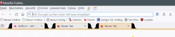
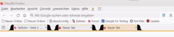
    Meine Tabs sehen z.Z. so aus.

    Die Farben werden so nicht bleiben!

    Woran ich gerade ab verzweifele, die Höhe der Vektorgrafiken!

    Links-rechts ist kein Problem, auch die Größe der Grafiken nicht,

    aber eben hoch oder tief.

    Was ich auch nicht hinbekomme, was wahrscheinlich auch nicht funktionieren wird,

    z.B. den "Closebutton" weiter nach rechts zu bekommen.

    Auch der Anfang des Labels, also das Icon weiter nach links.

    Hier mal mein "Bastelcode".

    CSS
    @-moz-document url(chrome://browser/content/browser.xhtml) {
    
        /* -------------------------------------------------------------------------- */
        /************** Trennlinie zwischen Fensterinhalt und Tableiste ***************/
        /* -------------------------------------------------------------------------- */
    
        #TabsToolbar {
            background-image: linear-gradient(to top, 
        /*    hsla(35, 80%, 60%, 0.55) 1px, hsla(35, 80%, 60%, 0.25) 4px 1px, transparent 6px) !important; */
            orange 2px, hsla(35, 80%, 60%, 0.5) 1px 5px, transparent 1px) !important;
        } 
    
        /* -------------------------------------------------------------------------- */
    
        /* -------------------------------------------------*/
        /************* aktiven Tab einfärben ****************/
        /* -------------------------------------------------*/


        /* --------------------------------------------------*/
        /************* passiven Tab einfärben ****************/
        /* --------------------------------------------------*/    


        .tab-label:not([selected]):not([multiselected]) {
            color: var(--uc-color-grey-lighter) !important;                                /* Inaktiver Tab: Schriftfarbe (Hellgrau) */
            
        }
    
        /*---------------------------------------------------*/
        /************** Tab schließen X hover  ***************/
        /*---------------------------------------------------*/
    
        .tab-content > .tab-close-button:hover {
            background:rgba(255, 0, 0, 0.4) !important;                                   /* Rot */
            box-shadow: 0 0 1em rgba(255, 0, 0, 1) !important;                               /* Rot, glow */
        /*    background: #E81123 !important;                                                 /* Kirschrot rgb(232, 17, 35) */
        /*    box-shadow: inset 0px 0px 4px 0px #ff0000 !important;                         /* Hellrot rgb(255, 0, 0) */
        }
        
        /*Tab Schließenbutton verschoben*/
    /*    
        .tab-close-button{
            flex-shrink: 0 !important;
            margin-right: -6px !important;
        }
    */
        /*Tab Schließenbutton auch beim Hovern sichtbar */
    /*
        .tabbrowser-tab:hover > .tab-stack > .tab-content > .tab-close-button
        {
            display: block !important;
        }
    */
        /*Symbol für Schließen (X) wieder sichtbar gemacht*/
    
        .close-icon {
            color: var(--uc-color-white-dark) !important;
        /*    color: rgba(255, 255, 255, 0.9) !important;                                    /* Weiß, nur leicht tranzparent, für ALLE    */
    
    
        list-style-image: url(chrome://global/skin/icons/close.svg) !important;
        height: 24px !important;
        padding: 7px !important;
    
    
        }
    
    
        /*---------------------------------------------------*/
        /***************** New Tab Icon  *********************/
        /*---------------------------------------------------*/
     
        /* Dies ist das Pluszeichen um einen neuen Tab zuöffnen */
     
        :is(.tabs-newtab-button,#tabs-newtab-button) {
        /*    list-style-image: url("../image/newtab-inverted.png") !important; */
            list-style-image: url("../icons/zoom-in.svg") !important;
            fill: var(--uc-color-white-dark) !important;
            -moz-image-region: rect(2px, 15px, 16px, 1px) !important;
        }
        :is(.tabs-newtab-button,#tabs-newtab-button):hover {
            fill: var(--uc-color-orange-normal) !important;
        }
    
        /*-----------------------------------------------*/
        /****     Tabtext nicht verkürzt bei hover    ****/
        /*-----------------------------------------------*/
    
        /* Ein längerer Tabtext wird am Ende ja ausgeblendet. */
        /* Diese Verkürzung bei hover hätte ich gerne verhindert. */
    
        .tabbrowser-tab:not(:hover) > .tab-stack > .tab-content > .tab-close-button {
            padding-inline-start: 7px !important;
            width: 24px !important;
        }
      
        .tabbrowser-tab[visuallyselected=true]:not(:hover),
        #tabbrowser-tabs:not([closebuttons=activetab]) > #tabbrowser-arrowscrollbox > .tabbrowser-tab:not([visuallyselected=true]):not(:hover) {
            --tab-label-mask-size: 1em !important;
        }
        
        /* Tabtext wird nicht ausgeblendet */
        
        .tab-label-container[textoverflow][labeldirection=ltr]:not([pinned]),
        .tab-label-container[textoverflow]:not([labeldirection]):not([pinned]):-moz-locale-dir(ltr) {
            mask-image: none !important;
        }    
        
        /*-------------------------------------------*/
        /****     Tabbar nach unten verschoben    ****/
        /*-------------------------------------------*/
        
        #navigator-toolbox {
            position: relative !important;
            padding-bottom: calc( var(--tab-min-height) + 10px ) !important;
        }
    
        #TabsToolbar {
            position: absolute !important;
            display: block !important;
            bottom: 0 !important;
        }
    
        #tabbrowser-tabs {
            width: 95vw !important;
        }
    
        /*---------------------------------------------*/
        /****     Symbole für about:xxx anpassen    ****/
        /*---------------------------------------------*/
    
        .tab-icon-image {
            -moz-context-properties: fill !important;
        /*    fill: #FFAA00 !important;    */
            fill: var(--uc-color-red-normal) !important;
        }
    
        /*---------------------------------------------------*/
        /****     Icon und Tabtext mittig ausgerichtet    ****/
        /*---------------------------------------------------*/
        /*    
        .tab-content:not([pinned])::before{
            display: -moz-box;
            content: "";
            -moz-box-flex: 1;
        }
        */    
        /*-----------------------------------------------------------------------*/
        /* Ausblenden des Meüs "Link in neuem Tab in Umgebung öffnen" im Popoup **/
        /*-----------------------------------------------------------------------*/
    
        #context_reopenInContainer {
            display: none !important;
          }    
          
        /*------------------------------------------------------*/
        /**** Ausblenden des Meüs "Add Tab to..."  im Popoup ****/
        /*------------------------------------------------------*/
        /*      
        #tabContextMenu > menuseparator:nth-child(31) {
        display: none !important;
        }
        #_fbcbdc47-ebd2-42f0-b2bb-7cc902ec2f40_-menuitem-_add-current-tab-menu {
        display: none !important;
        }      
        */      
        
        /*  TEST Tabs Ellipsis  */
    
        .tab-label {
            overflow: hidden !important;
            /*text-overflow: ellipsis !important;*/
            text-overflow: " …" !important;
            white-space: nowrap !important;
            max-width: 95% !important;    
        }
    
    
    /* ---------------------------------------------------------------------------- */
    
    /* --------------------------- Ab hier volgen Tests --------------------------- */
    
    /* ---------------------------------------------------------------------------- */
        .tabbrowser-tab:not([pinned]) .tab-background::before {
            left: -28px;
            background-image: url("../tab/tab-bottom-corner-left-australis.svg") !important;
            background-size: 28px !important;
        /*    background-size: 18px !important; */
        }
    
        .tabbrowser-tab:not([pinned]) .tab-background::after {
            right: -36px;
            background-image: url("../tab/tab-bottom-corner-right-australis.svg") !important;
            background-size: 28px !important;
        /*    background-size: 18px !important; */
        }


        .tabbrowser-tab:not([pinned]) .tab-background::before, 
        .tabbrowser-tab:not([pinned]) .tab-background::after {
            content: "";
            width: 36px !important;
            height: 36px !important;
            position: absolute;
            bottom: 5px;
            /*outline: 1px solid white !important;
            outline-offset: -1px !important;*/
            background-repeat: no-repeat !important;
            background-position: bottom left !important;
            stroke: orange !important;
        }
    
        /* By default, proton tabs have 2px + 2px = 4px space between them */
    /*    .tabbrowser-tab{
        padding-inline: 15px !important;
        } */
    
        :root {
            --ug-height: calc(var(--tab-min-height) / 2);
            --ug-radius: 18px;


        /* Rand  Farben */
        
    
        --ug-color-border: hsla(0, 0%, 83%, 0.5);
        --ug-stroke: hsla(0, 0%, 83%, 0.5);
        --ug-color1: hsla(0, 0%, 83%, 0.25);
    /*    --ug-color1: transparent; */
        --ug-color2:  hsla(35, 80%, 60%, 0.25);
    /*    --ug-color2: transparent; */
        --ug-color_hova: hsla(0, 0%, 63%, 0.25);
    /*    --ug-color_hova: transparent; */
        
        /* tab bar rand unten Farbe */
            --ug-color3: hsla(0, 0%, 83%, 1);
        
            /*--ug-color_test_text: hsla(0, 0%, 13%, 1) !important;*/
        }
        /*
        :root {
            --ug-stroke: hsla(0, 100%, 50%, 0.5);
            --ug-color-border: hsla(0, 100%, 50%, 0.5);
        }
        */
        
        /* Neuer Tabbuttin rund */ 
        #tabbrowser-arrowscrollbox-periphery #tabs-newtab-button .toolbarbutton-icon {
            /*margin-left: 8px !important;*/
            border-radius: 50% !important;
        }    
    
        
        /* tabs distance */
        
        .tabbrowser-tab:not([pinned]) {
            /*padding-inline: 16px !important;*/
            padding-inline: 28px !important;
            overflow: visible !important;
        }
        
    
           /*** tabs base ***/
    
           .tabbrowser-tab .tab-background {
            background-color: var(--ug-color1) !important;
            box-shadow: none !important;
            color: var(--ug-color_test_text) !important;
            /*border-image: linear-gradient(to top, 
                                   var(--ug-color1), var(--ug-color1)) 1 / 0 0 1px 0  !important;*/
            border-image-outset: 0 1px !important;
            fill: var(--ug-color1, transparent) !important;
            /*stroke: var(--ug-stroke) !important;*/
            outline: none !important;
            
            /*box-shadow:  inset 0px 1px var(--ug-color-border) !important;*/
        }
        
        
        /* tabs selected */
        
        .tabbrowser-tab:is([visuallyselected], [multiselected]) .tab-background {
            background-image: none !important;
            background-color: var(--ug-color2) !important;
            fill: var(--ug-color2, transparent) !important;
        }
        
        /* tabs unselected hover */
        
        .tabbrowser-tab:not([visuallyselected], [multiselected]):hover .tab-background {
            background-color: var(--ug-color_hova) !important;
            fill: var(--ug-color_hova) !important;
        }
                                                            
        
        /* Macht die Grafiken "durchsichtig" */    
        #TabsToolbar {
            -moz-context-properties: fill, stroke, stroke-opacity !important;
        }    


        /*** tabs Radien, borders ***/
    
        /*   basis   */
        .tabbrowser-tab .tab-background {
            border-radius: 0px 0px 0  0 !important;
            border-top: 1px solid orange !important;
            border-bottom: none !important;
            border-left: none !important;
            border-right: none !important;      
        }
    
        /*   Tabbeschriftung, breite höhe   */
        .tab-content {
            padding: 0px 0px;      
        }


    }    
    Alles anzeigen

    Die Grafiken: icons.zip

  • Tabform

    • Mira_Belle
    • 31. Oktober 2023 um 16:06
    Zitat von Horstmann

    ...

    Was die Tabs angeht, ich würde dabei gerne helfen wenn ich kann, aber du müsstest dich halt für einen Look entscheiden.

    ...

    Wenn ich das nur so genau wüsste.

    Bleiben wir, ICH, bei dem Design.

    Ich schrieb ja schon, dass ich das irgendwie, also die Rundungen, mit Grafiken machen möchte.

    Die Frage, mach ich das dann mit "Bildchen" (*.png) oder besser doch mit Vektorgrafiken.

    Was auf jeden Fall ausgeschlossen sein sollte, ist das "Spiegeln"!

    Es verursacht bei "Hintergründen" mit Farbverlauf Bildfehler.

    Bei Vektorgrafiken kann man ja nur eine ca. 3px- breite Linie definieren

    und per CSS dann die Farbe, die diese haben soll.

    Zum Verständnis, bei den hier zur Verfügung stehenden Vektorgrafiken handelt es sich um zwei Flächen!

    Was ich mich nun frage, ist es möglich auch innerhalb des SVG-Codes Farbverläufe zu definieren?

    Wobei min. eine Farbe von außen per CSS festgelegt werden sollte. Die hardcodet soll dann transparent sein,

    damit die Linie in etwa so ausschaut.

    Im Übrigen kann man in meinem Code die linke und rechte senkrechte "Begrenzung" des Tabs dann ausblenden,

    damit sich die Grafik besser einfügen lässt.

    OK, die Grafik ist hier mein Problem.

    Nicht besonders gut, aber ich hoffe man kann erkennen wohin es gehen soll.

  • Tabform

    • Mira_Belle
    • 31. Oktober 2023 um 15:15

    @Horstmann & 2002Andreas

    Ihr seid doof.

    Macht Euch nur lustig über mich, aber das macht mir gar nichts aus. :P

  • Tabform

    • Mira_Belle
    • 31. Oktober 2023 um 10:41
    Zitat von Sören Hentzschel

    Das ist doch nur ein altes Mockup. So wurde das Firefox-Design nie umgesetzt.

    Oh, sorry.

    Das ist ein Missverständnis :!:

    Es ging mir um das Aero, Fenster mit Rahmen und dieser inkl. Titelleiste transparent.

    Wie ich dieses Windows 10 Design hasse.

    OK, ist aber ot, hier soll es um die Tabs gehen.

    Also, ich habe meinen bisherigen Code etwas umgestellt und finde das Resultat auch einigermaßen annehmbar.

    Was ich aber noch irgendwie umsetzen möchte, sind der "Anfang" und das "Ende" der Tabs.

    Die "Formen" (umgesetzt mit Grafiken) bekommt man ja hin, aber dass die "Umrandung sich dann eben dem Design

    anpasst, wird wohl eine Herausforderung!

    Auch diese halbe Transparenz. :/

  • Tabform

    • Mira_Belle
    • 30. Oktober 2023 um 23:09

    Oh mein Gott, was ich dieses Design vermisse!

    https://www.clickonf5.org/wp-content/uploads/2009/10/Mockup40VistaTabsBottom.png

  • Tabform

    • Mira_Belle
    • 30. Oktober 2023 um 21:03
    Zitat von Horstmann

    Die Beispiele sind doch im Prinzip genau das was der CSS Code von MrOtherGuy erzeugt, was ist denn das Problem damit? :/

    Nicht ganz!

    1. Die Abgrenzung fehlt!

    2. Funktioniert nur bei "Hell" oder "Dunkel", mit meinem Theme eben leider nicht!

    Kann aber mal versuchen, den Hintergrund per CSS irgendwie einzubinden.

    Versuche mal "NordOrange"! Der ist zwar einfarbig, aber hat feine Linien um die Tabs.

    Nicht schön, mit diesem Code.

    Ach und ich verwende "abstract Orange-and-blue", da sind die Darstellungsfehler, grrr.

    Aber ja, bei der überwiegenden Mehrheit von den von mir getesteten Themes funktioniert es sehr gut.

    Aber ist es denn nicht langweilig, immer von anderen fertigen Code zu übernehmen?


    AH!

    Die Darstellungsfehler resultieren aus der "Spiegelung" der Vektorgrafik!

    :/ Das müsste ja zu beheben sein

    und die "Linie" bekomme ich auch irgendwie hin.

    Beispiele gibt es ja jetzt zur Genüge.

    Hat aber alles Zeit.

  • Tabform

    • Mira_Belle
    • 30. Oktober 2023 um 20:18

    Hi,

    die Abbildungen von 2002Andreas, sowie die im zweiten Link von .DeJaVu

    sind in etwa so, wie ich es mir vorgestellt habe.

    Mit "Bildchen" bekomme ich es einfach nicht hin.

    Nun werde ich versuchen, die Vektorgrafiken entsprechend zu bearbeiten.

    Das Problem ist, dass sich immer irgendwelche "Elemente" überschneiden und das schaut dann wirklich grauenhaft aus.

    Werde also noch etwas herumbasteln, sofern mir das z.Z. möglich ist.

    Hat ja Zeit.

  • Tabform

    • Mira_Belle
    • 30. Oktober 2023 um 13:57
    Zitat von 2002Andreas
    Zitat von Mira_Belle

    Also, dass die "orangen Ecken" nicht durch die "grauen Ecken" ersetzt werden.

    So?

    Andreas! Was denkst Du von mir? :/  ^^

    Nein, so hatte ich es mir nicht vorgestellt!

    "Hovern" soll ja schon sein, "grau", bei allen anderen Tabs, nur eben nicht beim Aktiven!

    ABER, was mich viel mehr stört, dieser Schatten der Tabs!

    Siehst Du das in Deinem Clip?

    Den bekomme ich einfach nicht weg und das sieht so, na ja, bescheiden aus. ;)

  • Tabform

    • Mira_Belle
    • 30. Oktober 2023 um 00:47

    Besser bekomme ich es nicht hin.

    Irgendwie gefällt es mir nicht.

    CSS
    @-moz-document url(chrome://browser/content/browser.xhtml) {
        #tabbrowser-tabs{
        --uc-tab-curve-size: 30px; /* 10px looks about like chromium - 17px looks close to Australis tabs */
        --tab-block-margin: 0px;
        --tab-min-height: 34px;
        }
        .tabbrowser-tab{
        padding-inline: 20px !important; /* By default, proton tabs have 2px + 2px = 4px space between them */
        }
        #TabsToolbar {
            border-bottom: 3px solid var(--uc-color-grey-light);
        }  
        #TabsToolbar{ --toolbarbutton-inner-padding: 6px !important; }
        .titlebar-spacer[type="pre-tabs"],
        .tabbrowser-tab::after{ border: none !important; }
        /*.tabbrowser-tab:hover > .tab-stack::before,
        .tabbrowser-tab:hover > .tab-stack::after,*/
        .tabbrowser-tab[selected] > .tab-stack::before,
        .tabbrowser-tab[selected] > .tab-stack::after{
        width: var(--uc-tab-curve-size);
    /*  height: 100%; */
        height: calc(65px - var(--uc-tab-curve-size));
        display: block;
        position: absolute;
        content: "";
        left: calc(0px - var(--uc-tab-curve-size));
        background-image: url("../icons/Tab-corner-grey.svg");
        background-size: var(--uc-tab-curve-size),0;
        background-repeat: no-repeat,no-repeat;
        background-position-y: bottom, bottom -1px;
        background-position-x: 0,0;
        }
        /*
        .tabbrowser-tab:hover > .tab-stack::before,
        .tabbrowser-tab:hover > .tab-stack::after{
        width: var(--uc-tab-curve-size);
        height: 100%;
        display: block;
        position: absolute;
        content: "";
        left: calc(0px - var(--uc-tab-curve-size));
        background-image: url("../icons/Tab-corner-grey.svg");
        background-size: var(--uc-tab-curve-size),0;
        background-repeat: no-repeat,no-repeat;
        background-position-y: bottom, bottom -1px;
        background-position-x: 0,0;
        }
        */
        .tabbrowser-tab[selected] > .tab-stack::after,
        .tabbrowser-tab:hover > .tab-stack::after{
        left: auto;
        right: calc(0px - var(--uc-tab-curve-size));
        transform: scaleX(-1);
        }
        /* -------------------------------------------------*/
        /************* aktiven Tab einfärben ****************/
        /* -------------------------------------------------*/
        .tab-background[selected] {
            background:rgba(255, 148, 0, 0.0) !important;                                                                                      
        /*  background:rgba(255, 148, 0, 0.3) !important;                           /* Aktiver Tab: Hintergrundfarbe (Orange)*/                                                    
        /*  box-shadow: inset  0px 0px 25px 0px var(--uc-color-orange-normal) !important;                   /* Aktiver Tab: Schatten Breite, Art und Farbe (Orange) */
        /*  box-shadow: inset 0px 0px 25px 0px var(--uc-color-grey-dark) !important; */
            box-shadow: hidden !important;
            /*  border: hidden !important;                                               /* Aktiver Tab: Rahmen ausblenden */
            border-top: 3px solid var(--uc-color-grey-light) !important;
            border-right: 3px solid var(--uc-color-grey-light) !important;
            border-left: 3px solid var(--uc-color-grey-light) !important;
            border-bottom: 3px solid var(--uc-color-grey-light) !important;
            /*  border: 1px solid #D4D4D4 !important;   */                               /* Aktiver Tab: Rahmen Breite, Art und Farbe */
            border-radius: 10px 10px 0px 0px !important;
        }
        .tab-label[selected] {
            color: var(--uc-color-white-dark) !important;                                               /* Aktiver Tab: Schriftfarbe (Weiß) */
        }
       
        .tabbrowser-tab:-moz-lwtheme {
            color: rgba(255, 165, 0, 0.1) !important;                               /* Weißer Rahmen um aktiven Tab entfernen (Orange)  */
        }
        /* --------------------------------------------------*/
        /************* passiven Tab einfärben ****************/
        /* --------------------------------------------------*/
        /*  .tab-background:not([selected]) { */
            .tabbrowser-tab:hover > stack > .tab-background:not([selected]) {
                background:rgba(225, 225, 225, 0.2) !important;                     /* Inaktiver Tab: Hintergrundfarbe (Hellgrau) */
                box-shadow: inset 0px 0px 5px 0px var(--uc-color-white-dark) !important;                    /* Inaktiver Tab: Schatten Breite, Art und Farbe (Hellgrau) */
                border: hidden !important;                                               /* Inaktiver Tab: Rahmen ausblenden */
            /*  border: 1px solid #D4D4D4 !important;   */                                  /* Inaktiver Tab: Rahmen Breite, Art und Farbe */
                border-radius: 18px 18px 0px 0px !important;
            }
       
            .tab-label:not([selected]):not([multiselected]) {
                color: var(--uc-color-grey-lighter) !important;                                         /* Inaktiver Tab: Schriftfarbe (Hellgrau) */
       
            }
        /*---------------------------------------------------*/
        /************** Tab schließen X hover  ***************/
        /*---------------------------------------------------*/
        .tab-content > .tab-close-button:hover {
            background:rgba(255, 0, 0, 0.4) !important;                    /* Rot */
            box-shadow: 0 0 1em rgba(255, 0, 0, 0.7) !important;               /* Rot, glow */
        /*  background: #E81123 !important;                         */          /* Kirschrot rgb(232, 17, 35) */
        /*  box-shadow: inset 0px 0px 4px 0px #ff0000 !important;   */          /* Hellrot rgb(255, 0, 0) */
        }
       
        /*Tab Schließenbutton verschoben*/
       
        .tab-close-button{
            flex-shrink: 0 !important;
            margin-right: -6px !important;
        }
        /*Tab Schließenbutton auch beim Hafern sichtbar */
        .tabbrowser-tab:hover > .tab-stack > .tab-content > .tab-close-button
        {
            display: block !important;
        }
        /*Symbol für Schließen (X) wieder sichtbar gemacht*/
        .close-icon {
            color: rgba(255, 255, 255, 0.9) !important;                             /* Weiß, nur leicht tranzparent, für ALLE   */
        }
        /*---------------------------------------------------*/
        /***************** New Tab Icon  *********************/
        /*---------------------------------------------------*/
     
        /* Dies ist das Pluszeichen um einen neuen Tab zuöffnen */
     
        :is(.tabs-newtab-button,#tabs-newtab-button) {
            list-style-image: url("../image/newtab-inverted.png") !important;
            -moz-image-region: rect(2px, 15px, 16px, 1px) !important;
        }
       
        /*-----------------------------------------------*/
        /****     Tabtext nicht verkürzt bei hover    ****/
        /*-----------------------------------------------*/
        /* Ein längerer Tabtext wird am Ende ja ausgeblendet. */
        /* Diese Verkürzung bei hover hätte ich gerne verhindert. */
        .tabbrowser-tab:not(:hover) > .tab-stack > .tab-content > .tab-close-button {
            padding-inline-start: 7px !important;
            width: 24px !important;
        }
     
        .tabbrowser-tab[visuallyselected=true]:not(:hover),
        #tabbrowser-tabs:not([closebuttons=activetab]) > #tabbrowser-arrowscrollbox > .tabbrowser-tab:not([visuallyselected=true]):not(:hover) {
            --tab-label-mask-size: 1em !important;
        }
       
        /* Tabtext wird nicht ausgeblendet */
       
        .tab-label-container[textoverflow][labeldirection=ltr]:not([pinned]),
        .tab-label-container[textoverflow]:not([labeldirection]):not([pinned]):-moz-locale-dir(ltr) {
            mask-image: none !important;
        }  
       
        /*-------------------------------------------*/
        /****     Tabbar nach unten verschoben    ****/
        /*-------------------------------------------*/
       
        #navigator-toolbox {
            position: relative !important;
            padding-bottom: calc( var(--tab-min-height) + 10px ) !important;
        }
        #TabsToolbar {
            position: absolute !important;
            display: block !important;
            bottom: 0 !important;
        }
        #tabbrowser-tabs {
            width: 95vw !important;
        }
        /*---------------------------------------------*/
        /****     Symbole für about:xxx anpassen    ****/
        /*---------------------------------------------*/
        .tab-icon-image {
            -moz-context-properties: fill !important;
        /*  fill: #FFAA00 !important;   */
            fill: var(--uc-color-red-normal) !important;
        }
        /*---------------------------------------------------*/
        /****     Icon und Tabtext mittig ausgerichtet    ****/
        /*---------------------------------------------------*/
        /*  
        .tab-content:not([pinned])::before{
            display: -moz-box;
            content: "";
            -moz-box-flex: 1;
        }
        */  
        /*-----------------------------------------------------------------------*/
        /* Ausblenden des Meüs "Link in neuem Tab in Umgebung öffnen" im Popoup **/
        /*-----------------------------------------------------------------------*/
        #context_reopenInContainer {
            display: none !important;
          }
         
        /*------------------------------------------------------*/
        /**** Ausblenden des Meüs "Add Tab to..."  im Popoup ****/
        /*------------------------------------------------------*/
        /*    
        #tabContextMenu > menuseparator:nth-child(31) {
        display: none !important;
        }
        #_fbcbdc47-ebd2-42f0-b2bb-7cc902ec2f40_-menuitem-_add-current-tab-menu {
        display: none !important;
        }    
        */    
       
        /*  TEST Tabs Ellipsis  */
        .tab-label {
            overflow: hidden !important;
            /*text-overflow: ellipsis !important;*/
            text-overflow: " …" !important;
            white-space: nowrap !important;
            max-width: 95% !important;    
        }
    }
    Alles anzeigen
  • Tabform

    • Mira_Belle
    • 29. Oktober 2023 um 22:35

    Du hast "meinen" Code genutzt?

    Egal, äh, nein, muss ich wissen, damit ich die richtigen Rückschlüsse daraus ziehen kann.

    Was mich aber viel mehr stört, dass ich nicht weiß, wie ich das Hovern beim Aktiven Tab verhindern kann,

    damit sich die "Rundungen" nicht verändern.

    Also, dass die "orangen Ecken" nicht durch die "grauen Ecken" ersetzt werden.

    Aber auch wenn das Resultat dem "Original" recht nahe kommt, es gefällt mir nicht.

    Es fehlt die durchgängige Linie.

    Auch ist der Tab im Grunde mit dem Fenster verbunden.

    Zieht sich über die gesamte Breite quasi die komplette "Tableiste".

    Selbst wenn ich die nicht aktiven Tabs transparent lasse, sieht das alles andere als gut aus.

    Ich habe noch einmal an diversen Werten "geschraubt",

    sieht, wie ich finde, nun etwas besser aus.

    Aber wie bekomme ich eine 2px dicke Linie über die komplette Breite da hin?

  • Tabform

    • Mira_Belle
    • 29. Oktober 2023 um 19:50
    Zitat von Dharkness

    Um das testen zu können, solltest Du aber auch die Grafiken mitliefern.

    Ö, ja, sorry.

    icons.zip

  • Tabform

    • Mira_Belle
    • 29. Oktober 2023 um 15:59

    @Horstmann & 2002Andreas

    Danke für Eure Hinweise und Tipps.

    Meine bisherige "Arbeit":

    CSS
        #tabbrowser-tabs{
        --uc-tab-curve-size: 17px; /* 10px looks about like chromium - 17px looks close to Australis tabs */
        --tab-block-margin: 0px;
        --tab-min-height: 34px;
        }
        .tabbrowser-tab{
        padding-inline: 15px !important; /* By default, proton tabs have 2px + 2px = 4px space between them */
        }
        #TabsToolbar{ --toolbarbutton-inner-padding: 6px !important; }
        .titlebar-spacer[type="pre-tabs"],
        .tabbrowser-tab::after{ border: none !important; }
        /*.tabbrowser-tab:hover > .tab-stack::before,
        .tabbrowser-tab:hover > .tab-stack::after,*/
        .tabbrowser-tab[selected] > .tab-stack::before,
        .tabbrowser-tab[selected] > .tab-stack::after{
        width: var(--uc-tab-curve-size);
        height: 100%;
        display: block;
        position: absolute;
        content: "";
        left: calc(0px - var(--uc-tab-curve-size));
        background-image: url("../icons/Tab-corner-orange.svg");
        background-size: var(--uc-tab-curve-size),0;
        background-repeat: no-repeat,no-repeat;
        background-position-y: bottom, bottom -1px;
        background-position-x: 0,0;
        }
        /*
        .tabbrowser-tab:hover > .tab-stack::before,
        .tabbrowser-tab:hover > .tab-stack::after{
        width: var(--uc-tab-curve-size);
        height: 100%;
        display: block;
        position: absolute;
        content: "";
        left: calc(0px - var(--uc-tab-curve-size));
        background-image: url("../icons/Tab-corner-grey.svg");
        background-size: var(--uc-tab-curve-size),0;
        background-repeat: no-repeat,no-repeat;
        background-position-y: bottom, bottom -1px;
        background-position-x: 0,0;
        }
        */
        .tabbrowser-tab[selected] > .tab-stack::after,
        .tabbrowser-tab:hover > .tab-stack::after{
        left: auto;
        right: calc(0px - var(--uc-tab-curve-size));
        transform: scaleX(-1);
        }
        /* -------------------------------------------------*/
        /************* aktiven Tab einfärben ****************/
        /* -------------------------------------------------*/
        .tab-background[selected] {                                                                                        
            background:rgba(255, 148, 0, 0.3) !important;                           /* Aktiver Tab: Hintergrundfarbe (Orange)*/                                                    
            box-shadow: inset  0px 0px 25px 0px var(--uc-color-orange-normal) !important;                   /* Aktiver Tab: Schatten Breite, Art und Farbe (Orange) */
            border: hidden !important;                                               /* Aktiver Tab: Rahmen ausblenden */
        /*  border: 1px solid #D4D4D4 !important;   */                               /* Aktiver Tab: Rahmen Breite, Art und Farbe */
            border-radius: 18px 18px 0px 0px !important;
        }
        .tab-label[selected] {
            color: var(--uc-color-white-dark) !important;                                               /* Aktiver Tab: Schriftfarbe (Weiß) */
        }
       
        .tabbrowser-tab:-moz-lwtheme {
            color: rgba(255, 165, 0, 0.1) !important;                               /* Weißer Rahmen um aktiven Tab entfernen (Orange)  */
        }
        /* --------------------------------------------------*/
        /************* passiven Tab einfärben ****************/
        /* --------------------------------------------------*/
        /*  .tab-background:not([selected]) { */
            .tabbrowser-tab:hover > stack > .tab-background:not([selected]) {
                background:rgba(225, 225, 225, 0.2) !important;                     /* Inaktiver Tab: Hintergrundfarbe (Hellgrau) */
                box-shadow: inset 0px 0px 5px 0px var(--uc-color-white-dark) !important;                    /* Inaktiver Tab: Schatten Breite, Art und Farbe (Hellgrau) */
                border: hidden !important;                                               /* Inaktiver Tab: Rahmen ausblenden */
            /*  border: 1px solid #D4D4D4 !important;   */                                  /* Inaktiver Tab: Rahmen Breite, Art und Farbe */
                border-radius: 18px 18px 0px 0px !important;
            }
       
            .tab-label:not([selected]):not([multiselected]) {
                color: var(--uc-color-grey-lighter) !important;                                         /* Inaktiver Tab: Schriftfarbe (Hellgrau) */
       
            }
        /*---------------------------------------------------*/
        /************** Tab schließen X hover  ***************/
        /*---------------------------------------------------*/
        .tab-content > .tab-close-button:hover {
            background:rgba(255, 0, 0, 0.4) !important;                    /* Rot */
            box-shadow: 0 0 1em rgba(255, 0, 0, 0.7) !important;               /* Rot, glow */
        /*  background: #E81123 !important;                         */          /* Kirschrot rgb(232, 17, 35) */
        /*  box-shadow: inset 0px 0px 4px 0px #ff0000 !important;   */          /* Hellrot rgb(255, 0, 0) */
        }
       
        /*Tab Schließenbutton verschoben*/
       
        .tab-close-button{
            flex-shrink: 0 !important;
            margin-right: -6px !important;
        }
        /*Tab Schließenbutton auch beim Hafern sichtbar */
        .tabbrowser-tab:hover > .tab-stack > .tab-content > .tab-close-button
        {
            display: block !important;
        }
        /*Symbol für Schließen (X) wieder sichtbar gemacht*/
        .close-icon {
            color: rgba(255, 255, 255, 0.9) !important;                             /* Weiß, nur leicht tranzparent, für ALLE   */
        }
        /*---------------------------------------------------*/
        /***************** New Tab Icon  *********************/
        /*---------------------------------------------------*/
     
        /* Dies ist das Pluszeichen um einen neuen Tab zuöffnen */
     
        :is(.tabs-newtab-button,#tabs-newtab-button) {
            list-style-image: url("../image/newtab-inverted.png") !important;
            -moz-image-region: rect(2px, 15px, 16px, 1px) !important;
        }
       
        /*-----------------------------------------------*/
        /****     Tabtext nicht verkürzt bei hover    ****/
        /*-----------------------------------------------*/
        /* Ein längerer Tabtext wird am Ende ja ausgeblendet. */
        /* Diese Verkürzung bei hover hätte ich gerne verhindert. */
        .tabbrowser-tab:not(:hover) > .tab-stack > .tab-content > .tab-close-button {
            padding-inline-start: 7px !important;
            width: 24px !important;
        }
     
        .tabbrowser-tab[visuallyselected=true]:not(:hover),
        #tabbrowser-tabs:not([closebuttons=activetab]) > #tabbrowser-arrowscrollbox > .tabbrowser-tab:not([visuallyselected=true]):not(:hover) {
            --tab-label-mask-size: 1em !important;
        }
       
        /* Tabtext wird nicht ausgeblendet */
       
        .tab-label-container[textoverflow][labeldirection=ltr]:not([pinned]),
        .tab-label-container[textoverflow]:not([labeldirection]):not([pinned]):-moz-locale-dir(ltr) {
            mask-image: none !important;
        }  
       
        /*-------------------------------------------*/
        /****     Tabbar nach unten verschoben    ****/
        /*-------------------------------------------*/
       
        #navigator-toolbox {
            position: relative !important;
            padding-bottom: calc( var(--tab-min-height) + 10px ) !important;
        }
        #TabsToolbar {
            position: absolute !important;
            display: block !important;
            bottom: 0 !important;
        }
        #tabbrowser-tabs {
            width: 95vw !important;
        }
        /*---------------------------------------------*/
        /****     Symbole für about:xxx anpassen    ****/
        /*---------------------------------------------*/
        .tab-icon-image {
            -moz-context-properties: fill !important;
        /*  fill: #FFAA00 !important;   */
            fill: var(--uc-color-red-normal) !important;
        }
        /*---------------------------------------------------*/
        /****     Icon und Tabtext mittig ausgerichtet    ****/
        /*---------------------------------------------------*/
        /*  
        .tab-content:not([pinned])::before{
            display: -moz-box;
            content: "";
            -moz-box-flex: 1;
        }
        */  
        /*-----------------------------------------------------------------------*/
        /* Ausblenden des Meüs "Link in neuem Tab in Umgebung öffnen" im Popoup **/
        /*-----------------------------------------------------------------------*/
        #context_reopenInContainer {
            display: none !important;
          }
         
        /*------------------------------------------------------*/
        /**** Ausblenden des Meüs "Add Tab to..."  im Popoup ****/
        /*------------------------------------------------------*/
        /*    
        #tabContextMenu > menuseparator:nth-child(31) {
        display: none !important;
        }
        #_fbcbdc47-ebd2-42f0-b2bb-7cc902ec2f40_-menuitem-_add-current-tab-menu {
        display: none !important;
        }    
        */    
       
        /*  TEST Tabs Ellipsis  */
        .tab-label {
            overflow: hidden !important;
            /*text-overflow: ellipsis !important;*/
            text-overflow: " …" !important;
            white-space: nowrap !important;
            max-width: 95% !important;    
        }
    Alles anzeigen

    Bin aber noch nicht so wirklich zu frieden!

    Die verwendeten Symbole sind eingefärbt!

    Wenn ich "Hovern" aktiviere, werden leider auch die Sybole des aktiven Tabs "ausgetauscht".

    Und was mir vorher nie so aufgefallen war,

    der Schließenbutten, der verändert die Größe, ...

    Da ist also noch der Wurm drin.

  • Tabform

    • Mira_Belle
    • 29. Oktober 2023 um 13:07

    Da mir gerade danach war und ich mich etwas beschäftigen wollte,

    kam ich auf die glorreiche Idee, auch weil hier z.Z. es andauernd um die Tabs ging,

    die Form der Tabs zu verändern.

    Jedoch, habe ich absolut keine Ahnung, wie ich das so hinbekommen soll.

    Vorweg, bei mir sind die Tabs direkt über dem Fenster!

    Und in etwa so, so habe ich mir das in etwas vorgestellt, hätte ich gerne die Tabs.

    Nur, wie könnte das, wenn es denn überhaupt geht, funktionieren?

    Z.Z. nutze ich das:

    CSS
        .tab-background {
            border-radius: 8px !important;
        }

    Mit dem Selektor bekomme ich es nicht hin.

    Hat jemand eine Idee?

Unterstütze uns!

Jährlich (2026)

69,4 %

69,4% (538,17 von 775 EUR)

Jetzt spenden
  1. Kontakt
  2. Datenschutz
  3. Impressum
Community-Software: WoltLab Suite™
Mastodon